
JoomlaWorks
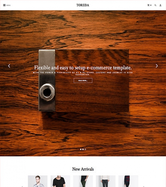
Building e-commerce sites doesn't have to be hard or full of compromises. Toreda uses the power and flexibility of K2 combined with K2Store (and J2Store for Joomla articles) to bring you an extremely easy way to setup and manage your online store.
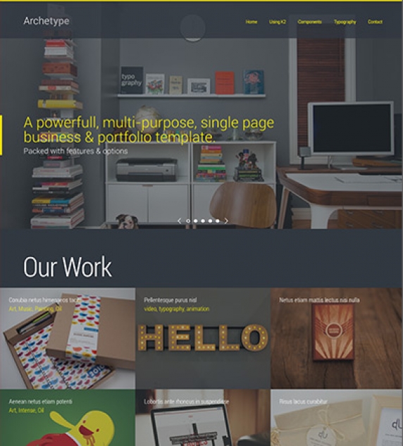
A flexible one-page template for any kind of corporate presentation or creative portfolio. Archetype comes with multiple layout options, 6 built-in colour variations and the ability to setup your own variation using the template options in the Joomla backend.
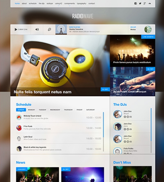
RadioWave is a fully featured template for online radio stations and music portals with built-in support for Radiojar, a popular web based service that lets you easily setup and manage your online radio station.
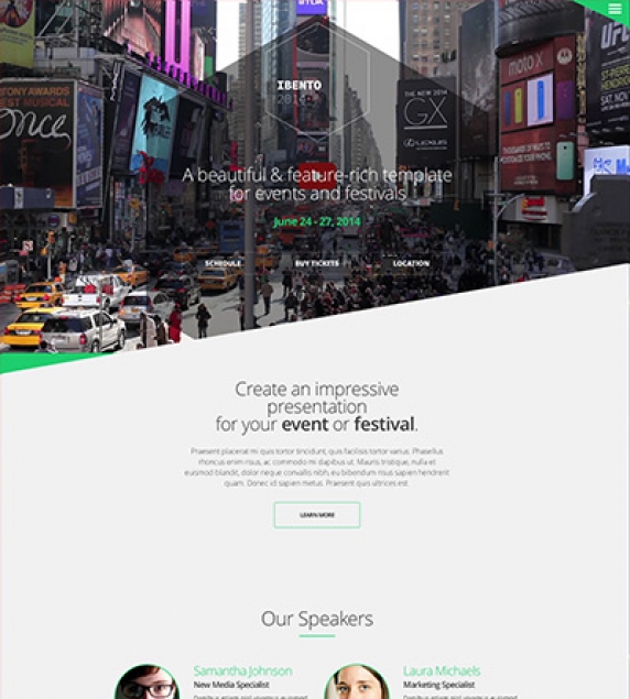
A sharp looking template built for events, conferences as well as any type of presentation for your app or service. Ibento comes with a customisable single page layout, custom colour variations, background video section, parallax views, and cutting edge animated transitions that leave a memorable impression.
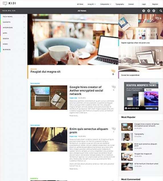
Built and optimized for content-heavy websites like news portals and online magazines, Kiji comes with a rich feature set including a smart layout system, multiple ways to present your content, a dynamic mega menu and custom colours for each section of your content.
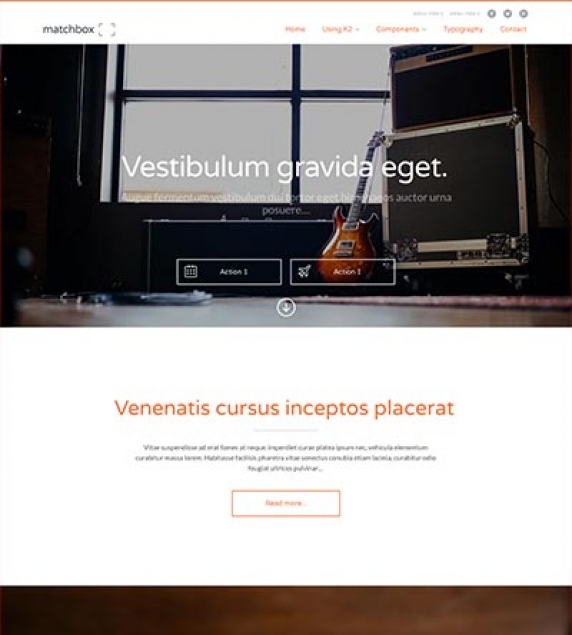
Matchbox is a general purpose template that is strikingly simple, yet impressive and friendly. Use it to build your next business, service, app-related presentation or anything inbetween.
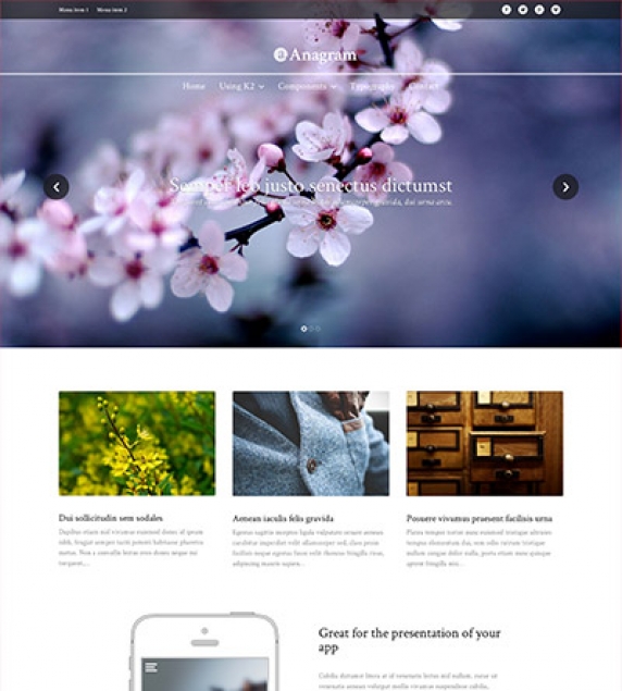
Anagram is an excellent choice for your business and portfolio showcase as well as any other type of general purpose presentation thanks to the template's minimal design and customisation options. Select from a wide variety of content blocks such as feature grids, video background sections, news feeds and testimonials, to create your own unique setup. The entire template is responsive so that your website looks great on mobile and tablet devices too.
Setting up our Demo
As you can see our template only uses the component views, category, user, tag item lists and item views.
Template functionality.
From the template’s settings view apart from the colours, you can also control most of the template’s functionality.
Choose between off canvas and normal navigation
Use your own colour variations
Enter your social links
Select the main text and header font.
All these settings are located in template’s parameters.
Setting up the menus.
In the template’s parameters (template specific tab) as mentioned above you can select the look and feel of your menu.
Whether you choose the off canvas navigation or the inline menu all you need to do is to publish your menu in the tamashi_Menu position.
Using a custom menu
This template offers you the ability to use one level custom menus in both the header of the site and the footer of the site.
The module position for these menus is tamashi_Footer_1.
K2 Content and Categories setup
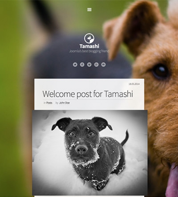
This template offers a simple Ghost inspired blog layout.
Due to the nature of this template higher quality/sizes images are required.
K2 Content module templates
There is a template override for the K2 Content module. You can see it in the sidebar (see the demo site for more information). To use this template in the sidebar you should use the default-listing module class.
Icon Fonts
We have included the Entypo family from fontello.com as well as the Simple Line icons.
You can download the font family and view the complete glyph guide from: http://graphicburger.com/simple-line-icons-webfont/
Animations
You can easily create your own animations using using using natural, declarative language
<!-- Reveal using custom parameters. -->
<divdata-scroll-reveal="enter left and move 50px over 1.33s"]]]]]]> Foo </div><divdata-scroll-reveal="enter from the bottom after 1s"]]]]]]> Bar </div><divdata-scroll-reveal="wait 2.5s and then ease-in-out 100px"]]]]]]> Baz </div>
More information can be found at http://scrollrevealjs.org/ and https://github.com/julianlloyd/scrollReveal.js
Module positions
- tamashi_Logo
- tamashi_Menu
- tamashi_Right
- tamashi_Top
- tamashi_Component
- tamashi_Footer_1
- tamashi_Footer_2
Image Size
The following image sizes are recommended for this template:
- XSmall 150
- Small 260
- Medium 400
- Large 900
- XLarge 1280
- Generic 900
- Category Image 100
- Avatar Size 100
- Commenter Image 48
Module Suffixes
- .left adds a float:left to a block.
- .right adds a float:right to a block.
- .text-center adds a center alignment to a block.
- .text-right adds a right text alignment to a block.
- .text-left adds a left text alignment to a block.
- .default-listing for the K2 item listings.
Additional Components
Apart from the K2 component we offer CSS styling for the following components
com_contact (form only)
com_users ( all views )
com_search
com_weblinks
com_newsfeeds
Commercial Extensions
Simple Image Gallery Pro - After installing it go to the Extension's parameters Layout template for image galleries and choose the one named after the template, i.e. matchbox and matchbox_module.
For developers and enthusiasts
The Grid
We are using ZURB's foundation grid for this template. You can find out more about foundation here: http://foundation.zurb.com/
Addtionally we have added a grid for larger (xl) and very large (xxl) viewports.
Block Grid - for developers and enthusiasts
We have included Foundation's block grid.
More info can be found here. http://foundation.zurb.com/docs/components/block-grid.html
Visibility Classes
If you need complete control over your modules in responsive states we 've got you covered. This template uses the power of the The most advanced responsive front-end framework in the world, ZURB's foundation.
.hide-for-small Hides the module in viewports bellow 900px
.show-for-small Shows the module in viewports bellow 900px
.hide-for-medium Hides the module in viewports above 768px and bellow 1279px
.hide-for-medium-up Hides the module in viewports above 768px
.show-for-medium Shows the module in viewports above 768px and bellow 1279px
.show-for-medium-up Shows the module in viewports above 768px
.show-for-medium-down Shows the module in viewports bellow 1279px
.show-for-large Shows the module in viewports above 1280px and bellow 1440px
.show-for-large-up Shows the module in viewports above 1280px
.hide-for-large Hides the module in viewports above 1280px and bellow 1440px
.hide-for-large-up Hides the module in viewports above 1280px
.show-for-xlarge Shows the module in viewports above 1440px
.hide-for-xlarge Hides the module in viewports above 1440px
.show-for-landscape Shows the module in the landscape orientation
.hide-for-landscape Hides the module in the landscape orientation
.show-for-portrait Shows the module in the portrait orientation
.hide-for-portrait Hides the module in the portrait orientation
All these classes are located in the template.css and can be easily expanded and/or edited and can be used for every block of your template, not just your modules.
More info can be found here: http://foundation.zurb.com/docs/components/visibility.html
k2.css
As you might have noticed this template does not use the default k2.css. We have completely rewritten all the template's styles to be more efficient. In case you download the standalone template package we have included a blank k2.css file in our distribution to avoid 'breaking' you site.
SASS Support
In your template's /css folder you will find a /src subfolder. There you will find all out .sass files.
We have also used Bourbon which is a simple and lightweight mixin library for Sass
What is SASS: http://sass-lang.com/
What is Bourbon: http://bourbon.io/
Visual Walkthrough


https://www.joomlaworks.net/component/k2/itemlist/user/989-fotis&format=feed?start=60#sigProIde7649cec4e

Setting up our Demo
As you can see our template in the frontpage only uses K2 modules instead of the component view. As for the component view you can choose between the blog view and the gridded view.
The Front-page and module positions
As stated above you have numerous options and module positions to choose from for your front page.
There are three module positions placed one bellow the other so you can order your content more effectively including a slideshow which covers the entire viewport in certain resolutions.
Furthermore there is a module position in the component area if you choose to use modules instead of the component.
Finally there are positions bellow the component area, a sidebar, three positions next to each other in the footer and two full width module positions.
Callouts
This template offers two full width module positions perfect for full width “call to action” modules. These positions are anagram_Top_Callout and anagram_Lower_Full. In the demo site we have published the Call action and Video background modules.
Template functionality.
From the template’s settings view apart from the colours, you can also control most of the template’s functionality.
- Choose between off canvas and normal navigation
- Use your own colour variations
- Enter your social links
- Select the main text and header font.
All these settings are located in template’s parameters.
Setting up the menus.
In the template’s parameters (template specific tab) as mentioned above you can select the look and feel of your menu.
Whether you choose the off canvas navigation or the inline menu all you need to do is to publish your menu in the anagram_Menu position.
Using a custom menu
This template offers you the ability to use one level custom menus in both the header of the site and the footer of the site.
The module positions for these menus are anagram_Secondary_Menu and anagram_Footer_Menu.
Using a social menu
The social menu (the one placed on the footer) uses its own overrides. You need to choose the appropriate layout for the module’s settings. You can do this by selecting the “social” option from the Alternate Layout select box.
Finally don’t forget to set the appropriate CSS class (Link CSS Style). The class should be the name of the network, e.g. facebook, twitter, google-plus, vimeo etc.
K2 Content and Categories setup
This template offers two different layouts, now for each image size.
a typical blog layout.
a gridded layout
To use one of these layouts you do not need to change between K2 templates, all you need to do it to choose the appropriate set of items.
Using the leading items
By using the leading items and the large image size you will get the blog layout.
Using the secondary items
By using the primary items and the medium image size you will get can set up your gridded layout
K2 Content module templates
- 2Block - Used the in testimonials module
- 3BlockGrid - Used in the top gridded module
- Banner - The banners on the frontage’s sidebar
- Callout - The “Call to Action” module
- Component - Component styled module
- SlideIn - For animated modules
- Slideshow - For K2 items
- Video - For creating stunning video backgrounds
Icon Fonts
We have included the Entypo family from fontello.com as well as the Drip Icons.
You can download the font family and view the complete glyph guide from: http://demo.amitjakhu.com/dripicons/
Animations
You can easily create your own animations using natural, declarative language:
<!-- Reveal using custom parameters -->
<div data-scroll-reveal="enter left and move 50px over 1.33s">Foo</div>
<div data-scroll-reveal="enter from the bottom after 1s">Bar</div>
<div data-scroll-reveal="wait 2.5s and then ease-in-out 100px">Baz</div>
More information can be found at https://scrollrevealjs.org/ and at https://github.com/jlmakes/scrollreveal (GitHub repo).
Module positions
- anagram_Hero
- anagram_Menu
- anagram_Secondary_Menu
- anagram_Top_1
- anagram_Top_2
- anagram_Top_Callout
- anagram_Breadcrumb
- anagram_Component
- anagram_Right
- anagram_Lower_Full
- anagram_Lower_1
- anagram_Lower_2
- anagram_Footer_1
- anagram_Footer_2
- anagram_Footer_3
- anagram_Footer_Menu
Image Sizes
The following image sizes are recommended for this template:
- * XSmall 150
- * Small 260
- * Medium 400
- * Large 900
- * XLarge 1280
- * Generic 900
- * Category Image 100
- * Avatar Size 100
- * Commenter Image 48
Module Suffixes
- * .left adds a float:left to a block.
- * .right adds a float:right to a block.
- * .text-center adds a center alignment to a block.
- * .text-right adds a right text alignment to a block.
- * .text-left adds a left text alignment to a block.
Additional Components
Apart from the K2 component we offer CSS styling for the following components
com_contact (form only)
com_users ( all views )
com_search
com_weblinks
com_newsfeeds
Commercial Extensions
Simple Image Gallery Pro - After installing it go to the Extension's parameters Layout template for image galleries and choose the one named after the template, i.e. matchbox and matchbox_module.
For developers and enthusiasts
The Grid
We are using ZURB's foundation grid for this template. You can find out more about foundation here: http://foundation.zurb.com/
Addtionally we have added a grid for larger (xl) and very large (xxl) viewports.
Block Grid - for developers and enthusiasts
We have included Foundation's block grid.
More info can be found here. http://foundation.zurb.com/docs/components/block-grid.html
Visibility Classes
If you need complete control over your modules in responsive states we 've got you covered. This template uses the power of the The most advanced responsive front-end framework in the world, ZURB's foundation.
.hide-for-small Hides the module in viewports bellow 900px
.show-for-small Shows the module in viewports bellow 900px
.hide-for-medium Hides the module in viewports above 768px and bellow 1279px
.hide-for-medium-up Hides the module in viewports above 768px
.show-for-medium Shows the module in viewports above 768px and bellow 1279px
.show-for-medium-up Shows the module in viewports above 768px
.show-for-medium-down Shows the module in viewports bellow 1279px
.show-for-large Shows the module in viewports above 1280px and bellow 1440px
.show-for-large-up Shows the module in viewports above 1280px
.hide-for-large Hides the module in viewports above 1280px and bellow 1440px
.hide-for-large-up Hides the module in viewports above 1280px
.show-for-xlarge Shows the module in viewports above 1440px
.hide-for-xlarge Hides the module in viewports above 1440px
.show-for-landscape Shows the module in the landscape orientation
.hide-for-landscape Hides the module in the landscape orientation
.show-for-portrait Shows the module in the portrait orientation
.hide-for-portrait Hides the module in the portrait orientation
All these classes are located in the template.css and can be easily expanded and/or edited and can be used for every block of your template, not just your modules.
More info can be found here: http://foundation.zurb.com/docs/components/visibility.html
k2.css
As you might have noticed this template does not use the default k2.css. We have completely rewritten all the template's styles to be more efficient. In case you download the standalone template package we have included a blank k2.css file in our distribution to avoid 'breaking' you site.
SASS Support
In your template's /css folder you will find a /src subfolder. There you will find all out .sass files.
We have also used Bourbon which is a simple and lightweight mixin library for Sass
What is SASS: http://sass-lang.com/
What is Bourbon: http://bourbon.io/
Visual Walkthrough


https://www.joomlaworks.net/component/k2/itemlist/user/989-fotis&format=feed?start=60#sigProIdbf570395d3

Setting up our Demo
As you can see our template in the frontpage only uses K2 modules instead of the component view. As for the component view you can choose between the blog view, the gridded view to the small image on the left views.
The Front-page and module positions
As stated above you have numerous options and module positions to choose from for your front page.
There are five module positions placed one bellow the other so you can order your content more effectively.
Furthermore there is a module position in the component area if you choose to use modules instead of the component.
Finally there are positions above the component area (Hero unit) a sidebar and three positions next to each other in the footer.
Template functionality
From the template’s settings view apart from the colours, you can also control most of the template’s functionality.
- Choose between a fixed or a static menu
- Choose between off canvas and normal navigation
- Choose between coloured and “white coloured” navigation
- Choose the background image of the site
- Use your own colour variations
- Enter your social links
- All these settings are located in template’s parameters.
Setting up the menus.
In the template’s parameters (template specific tab) as mentioned above you can select the look and feel of your menu.
Please note that off canvas navigation will not work with a fixed header.
Using a custom menu
You may use as many custom menus as you wish in the Footer.
The list you see in the demo is a custom menu.
Using the secondary menu
A secondary menu (only one level menus) may be used in the matchbox_SecondaryMenu position. This position is directly above the main menu and next to the social links.
Using a social menu
The social menu (the one placed on the footer) uses its own overrides. You need to choose the appropriate layout for the module’s settings. You can do this by selecting the “social” option from the Alternate Layout select box.
Finally don’t forget to set the appropriate CSS class (Link CSS Style). The class should be the name of the network, e.g. facebook, twitter, google-plus, vimeo etc.
Custom Gallery module
The gallery you see in the demo’s frontage is a custom HTML module so you can use every gallery you want. Simple Image Gallery Pro is required for this module to work.
Use this snippet to duplicate the module in your site.
<div class="column small-12 large-8 gallery-area" data-scroll-reveal="enter left and move 80px over 0.6s"> { gallery }demo:300:250:0:1::matchbox_module{ /gallery } </div> <div class="column small-12 large-4 text-area" data-scroll-reveal="enter right and move 80px over 0.6s"> <p class="leading">Vitae mi ultricies, lacinia lectus id, sodales turpis. Vivamus id tincidunt odio. Nunc nec convallis tellus. Nam sed sem mi. Curabitur eget lacus dictum, ornare neque eget, tristique dui. Interdum et malesuada fames ac ante ipsum primis in faucibus.</p> <p>Vitae mi ultricies, lacinia lectus id, sodales turpis. Vivamus id tincidunt odio. Nunc nec convallis tellus. Nam sed sem mi. Curabitur eget lacus dictum, ornare neque eget, tristique dui. Interdum et malesuada fames ac ante ipsum primis in faucibus.</p> </div> More information on Simple Image Gallery’s snippets can be found here: https://www.joomlaworks.net/support/docs/simple-image-gallery-pro
K2 Content and Categories setup
This template offers three different layouts, now for each image size.
- a typical blog layout.
- a gridded layout
- an image on the left layout
- To use one of these layouts you do not need to change between K2 templates, all you need to do it to choose the appropriate set of items.
Using the leading items
By using the leading items and the large image size you will get the blog layout.
Using the primary items
By using the primary items and the medium image size you will get can set up your gridded layout
Using the secondary items
With the secondary items you can use small sized images to get the “Images on the left layout”.
Extrafields
This template offers a wide range of extra fields. They all work as item enhancements. Whether you need social links or extra links for the hero unit you ‘ve got you covered. The single extra field group will provide you with all the extra elements you need.
K2 Content module templates
4BlockGrid - Used in “The team” module
Callout - Used in callouts with images
CalloutNoImage - use this for callouts without an image
Default
Footer - the footer lists
Hero - the hero unit
SlideIn - for animated modules
Slider - for the icon slider
Icon Fonts
We have included the Entypo family from fontello.com as well as the Simple Line Icons.
You can download the font family and view the complete glyph guide from: http://graphicburger.com/simple-line-icons-webfont/
Using Icon Fonts in the slider (K2 Content module).
After you have downloaded the glyph guide for the Simple Line icons you will get all the necessary code. (just click on the icon to get the code).
Animations
You can easily create your own animations using using using natural, declarative language
<div data-scroll-reveal="enter left and move 50px over 1.33s">Foo</div> <div data-scroll-reveal="enter from the bottom after 1s">Bar</div> <div data-scroll-reveal="wait 2.5s and then ease-in-out 100px">Baz</div>
More information can be found at http://scrollrevealjs.org/ and https://github.com/julianlloyd/scrollReveal.js
Module positions
- matchbox_Menu
- matchbox_SecondaryMenu
- matchbox_Slideshow
- matchbox_Breadcrumbs
- matchbox_Component
- matchbox_Lower_Component
- matchbox_Right
- matchbox_Under_Component_1
- matchbox_Under_Component_2
- matchbox_Under_Component_3
- matchbox_Under_Component_4
- matchbox_Under_Component_5
- matchbox_Above_Footer
- matchbox_Footer_1
- matchbox_Footer_2
- matchbox_Footer_3
Image Sizes
The following image sizes are recommended for this template:
- XSmall 100
- Small 200
- Medium 400
- Large 900
- XLarge 1366
- Generic 320
- Category Image 100
- Avatar Size 150
- Commenter Image 70
Module Suffixes
- .left adds a float:left to a block.
- .right adds a float:right to a block
- .text-center adds a center alignment to a block.
- .text-right adds a right text alignment to a block
- .text-left adds a left text alignment to a block
Additional Components
Apart from the K2 component we offer CSS styling for the following components
com_contact (form only)
com_users ( all views )
com_search
com_weblinks
com_newsfeeds
Commercial Extensions
Simple Image Gallery Pro - After installing it go to the Extension's parameters Layout template for image galleries and choose the one named after the template, i.e. matchbox and matchbox_module.
For developers and enthusiasts
The Grid
We are using ZURB's foundation grid for this template. You can find out more about foundation here: http://foundation.zurb.com/
Addtionally we have added a grid for larger (xl) and very large (xxl) viewports.
Block Grid - for developers and enthusiasts
We have included Foundation's block grid.
More info can be found here. http://foundation.zurb.com/docs/components/block-grid.html
Visibility Classes
If you need complete control over your modules in responsive states we 've got you covered. This template uses the power of the The most advanced responsive front-end framework in the world, ZURB's foundation.
.hide-for-small Hides the module in viewports bellow 900px
.show-for-small Shows the module in viewports bellow 900px
.hide-for-medium Hides the module in viewports above 768px and bellow 1279px
.hide-for-medium-up Hides the module in viewports above 768px
.show-for-medium Shows the module in viewports above 768px and bellow 1279px
.show-for-medium-up Shows the module in viewports above 768px
.show-for-medium-down Shows the module in viewports bellow 1279px
.show-for-large Shows the module in viewports above 1280px and bellow 1440px
.show-for-large-up Shows the module in viewports above 1280px
.hide-for-large Hides the module in viewports above 1280px and bellow 1440px
.hide-for-large-up Hides the module in viewports above 1280px
.show-for-xlarge Shows the module in viewports above 1440px
.hide-for-xlarge Hides the module in viewports above 1440px
.show-for-landscape Shows the module in the landscape orientation
.hide-for-landscape Hides the module in the landscape orientation
.show-for-portrait Shows the module in the portrait orientation
.hide-for-portrait Hides the module in the portrait orientation
All these classes are located in the template.css and can be easily expanded and/or edited and can be used for every block of your template, not just your modules.
More info can be found here: http://foundation.zurb.com/docs/components/visibility.html
k2.css
As you might have noticed this template does not use the default k2.css. We have completely rewritten all the template's styles to be more efficient. In case you download the standalone template package we have included a blank k2.css file in our distribution to avoid 'breaking' you site.
SASS Support
In your template's /css folder you will find a /src subfolder. There you will find all out .sass files.
We have also used Bourbon which is a simple and lightweight mixin library for Sass
What is SASS: http://sass-lang.com/
What is Bourbon: http://bourbon.io/
Visual Walkthrough


https://www.joomlaworks.net/component/k2/itemlist/user/989-fotis&format=feed?start=60#sigProId704238286b