Responsive navigation has been covered in lots of tutorials across the web. But let's face it, Joomla has it's (modular) way of things. For one, you know that the Joomla menu has a default HTML output using an unordered list (ul), which is pretty generic. If you've done Joomla template overrides before, you know that the process of overriding the HTML output of any extension may be simple, but there's a small catch for the menu module specifically. Since the output of the menu module is heavily mixing HTML with PHP code (due to the nature of the code, to be honest), if you perform changes to the HTML output, you may be put in a position to contantly monitor if your override works whenever a new Joomla update is released. Not that it's happened too often, but it has happened...
How cool would it be if we could leave the HTML output of the menu module untouched and "responsive-ize" our menu using just a few lines of JavaScript/jQuery and CSS? As you'll see in the code snippets following, we're not touching the menu module overrides at all. We'll be extending our existing menu by creating a "classic" responsive menu that is vertical and gets triggered by an anchor link when our site is viewed on a mobile or tablet device. So our menu will switch from a typical horizontal menu to a vertical one.
We'll be doing things in 3 steps: first place the required HTML and JavaScript, then add the CSS for the responsive state and thirdly, extend the CSS to animate the menu when toggled on and off.
The code examples will work on most tablet and mobile devices. We'll assume that the desktop layout is already handled by your template.
Beside the static code examples, we'll be using live code examples embedded from jsFiddle.
So let's get started!
Step 1a: Some Basic Markup
The markup is pretty straightforward. Open up the index.php file of your Joomla template and locate the module position in which we're publishing our main (multi level) menu. Let's say this module position is called "main_menu". We'll be wrapping the module position with a <nav> element (part of the HTML5 spec), but you can use any other block element (e.g. a <div>). Inside the <nav> element we're adding an anchor link with a hash (#) for the URL. This anchor element will be used as the menu toggler when our site is rendered in a tablet or mobile device. On desktop browsers our menu will look as it did before implementing this (unobtrusive) technique :)
Here's the code to add in our index.php file:
<?php if($this->countModules('main_menu')): ?> <nav id="siteNav"> <a href="#" id="menuToggler" class="show-on-small">☰ Menu</a>
<jdoc:include type="modules" name="main_menu" style="" /> </nav> <?php endif ;?> As you'll notice, the <nav> element has an id attribute of "menuToggler". This is going to be used by our small jQuery snippet to attach the necessary open/close (toggle) behaviour when clicking the anchor element. The anchor element encloses the so called "navicon" or "hamburger icon" (☰) that we all know and use in many popular apps in tablet and mobile devices.
When on a tablet or mobile device, we're gonna be hiding the entire menu but the anchor, then use the anchor as the toggler (when clicked) to show/hide the menu. We do this by adding "a#menutoggler {display:none;}" in our template's CSS file. And we're adding some basic CSS to lay out the menu for this demo. On a real live site, this will already be handled by your template.
Step 1b: A simple jQuery script
Instead of using complex JavaScript based animation to toggle our responsive menu, we're going to use CSS transitions and transforms. They are easier to implement and will render better now and in the future. So, we'll only be adding JavaScript for the toggler functionality in the anchor link. This snippet swaps "visibility" classes on the menu container.
This is the code:
<script>
(function($){ $(document).ready(function(){ $('#menuToggler').on('click', function(e){ e.preventDefault; $('#siteNav ul.menu').toggleClass('menuIsActive'); }); }); })(jQuery);
</script>
Nothing fancy or complicated here. Just simple class toggling. The a element with the id #menuToggler simply changes the class of your <ul> menu. Notice that the menu module's output already includes the class ".menu", so we're using this class to target our entire menu list from top to bottom. The visibility and all the effects will later be handled by CSS.
If you're not already loading jQuery on your site, check your template settings for a related option. Almost all templates nowadays load jQuery by default. Otherwise look for a plugin to load jQuery on your site or simply add jQuery directly in your template's <head> tag.
Step 2: The CSS code
We've covered the "desktop" state so far. Essentially what we've added is still not visible to anyone. We'll move on now and add the required CSS media queries to control the visibility of our menu on tablet and mobile devices. We'll assume the screen limit for such devices starts at a maximum of 800px. The code example that follows will make the anchor link visible when we switch to a screen that is 800px wide or less, while hiding the desktop menu and changing its orientation to vertical at the same time.
(From my experience I have noticed that building my menu module code based on the '>' child combinator requires significantly less code and fewer overrides, meaning cleaner and more sustainable code)
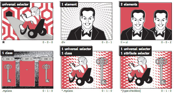
 CSS Specificity with icons inspired by "The Shining"
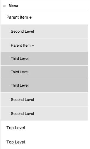
I'm styling each level distinctly so when I have to "decorate" multi level menus I don't have to reset paddings, borders, radiuses, shadows (you get the picture...) on every level. Is it over specified? Sure.. but the code is much cleaner.
Step 3: Putting the menu off-canvas & animating things
Now that we have our basic working example of our responsive menu, we'll move on and spice it up a bit. We'll push the vertical menu "off-canvas" in its "off" state and the toggler will display back the menu using a linear slide-in effect from the left. Notice the CSS code blocks added that control the transition & transforms.
And there you have it!

The End Result
Moving forward: tips, techniques & a faster workflow
A note on media queries & breakpoints
In this demo we have a breakpoint at 800px. As part of my worklflow when either designing or developing a website I tend to use wider breakpoints than this. I usually try to take advantage of the touch capabilities of the device so I would realistically set my breakpoint between 1024 and 900 pixels.
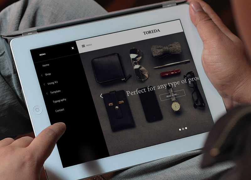
 Taking advantage of larger screens and touch capabilities - Toreda on an iPad
Cross browser
Using CSS transitions prevents us from using "display:none/block" states. I have chosen to use positioning and opacity instead to create this effect.
If you want cross browser opacity for IE8 or earlier (although not required in practice) you can use the proprietary -ms-filter: "progid:DXImageTransform.Microsoft.Alpha(Opacity=100)" value.
Pushing the menu on/off canvas
You can use Modernizr to detect if 3D transforms are supported and provide a fallback CSS class for browsers which don't support them.
For Joomla templates I have found this build of Modernizr to be very helpful while not being too big.
Using SCSS
To make my life a bit easier and save me some hours I use CSS preprocessors and in this case SASS.
To handle all the semi-complex transitions and CSS transforms I have found bourbon both to have excellent documentation and to be super easy to use.
Worried about the -webkit- prefixes and the complex 3Dtransform code?
Well.. no need to, simply use this snippet for your simple transitions and this snippet for 3D transitions so you can code your menu in no time.
SASS lover?
I have created a SASS version as well. You can find it here.
