All fonts are not created equal
The width and height of each character is usually different across typefaces for the same weight, style and font-size. I know this can be very confusing at first so let’s take a look at an example.
In the screenshot below you can see the letters of two different typefaces: Oswald (in blue) and Open Sans (in red) both set with exactly the same font size, line height and weight but different colour and font family. (There is also a live version available if you care to tinker with it on codepen.)
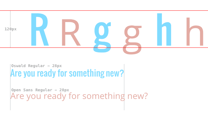
Notice something peculiar? None of the letters are actually 120px in height (marked by the two horizontal lines) and there’s a big difference in what 120px means between the font-families themselves too. And this goes for the width of the characters as well. Without getting into too much detail, the reasons for this are mostly related to the way fonts are designed although there might cases where it’s just a matter of a badly designed font.
The lesson to be learned here is that choosing a font, or replacing an existing one, should be practiced with caution. Changing a font-family without considering the size, among other things, may affect the readability of your text or may cause unwanted text wrapping. On-line tools likeTiff and Typewonder can help you spot these differences in size so that you can make sure you’re picking the right typeface for the job or determine the adjustments you need to make.
Counting the font-family …members.
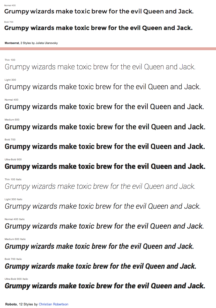
Now that there’s an abundance of web fonts on-line, one important thing to note is that not all font families available have the same amount of widths and styles. Google Web fonts hosts hundreds of font families some of which have up to 12 different styles like Christian Robertsons’s Roboto, whereas others, like Julieta Ulanovsky’s beautiful Montserrat has only two styles available:
This doesn’t mean that one font-family is better than the other but if you’re planning to use a web font with long body of text, it is generally preferable to pick a font with many styles available to ensure the formatting of the text such as bolding and italicising will be rendered correctly. If, on the other hand, you’re looking for a font family to replace an existing one you need to make sure the font family you choose has matching styles.
Font rendering issues
Another crucial difference among fonts is the way they are rendered on screen. This means that the font you choose might look different to the visitors of your website depending on the browser and the operating system they might be using. In most cases the differences for a given font family can be minor and noticeable only on smaller text sizes but there are cases where it can seriously affect the legibility of your text.
Making a font look good across a wide range of systems, also known as ‘font hinting’ is a lot harder than it sounds and requires a substantial amount of work on the font designer’s behalf.
Some font services like Typekit offer previews of each font style available across a number of systems and browsers to save you from the trouble of having to check them all by yourself. For the rest of the fonts it’s up to you to do the testing though.
Setting your typography on the browser.
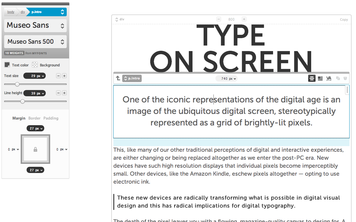
It's a common secret that the best way to test all of the above and make sure you’ve made the right adjustments, is to do the testing right in the browser, but this is can be tedious since it might require a lot of code writing and browser reloading.
Fortunately, on-line tools such as Typecast provide a complete design environment that lets you experiment with thousands of fonts and practically every aspect of typographic design.
EXTRA TIP: Avoid using 'Lorem Ipsum’ text when designing text as it can often be misleading since it prevents you from reading the actual text you are typesetting. For optimum results, use an excerpt of readable text written on the target language of your website.
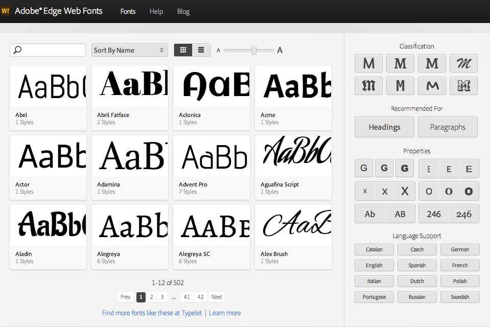
Beyond Google Web fonts.
Tired of using the same ol' fonts from the Google Web Fonts directory? There are plenty of resources online resources such as Font Squirrel and the recently updated Edge Web Fonts service from Adobe that provides even more great choices and alternatives.
In fact Adobe’s Edge font service uses Typekit’s excellent interface for discovering and filtering the available web fonts, a feature that’s sorely missing from Google’s Web Fonts service.
Typekit easter eggs
Speaking of Typekit and Adobe, I’ve recently discovered that a handful of typefaces available on Typekit’s service support even more languages than it is officially stated on their website.
Beautifully designed fonts like FF Din, FF Meta and Myria Pro provide support for extra languages such as Greek or Vietnamese.
Typography beyond text
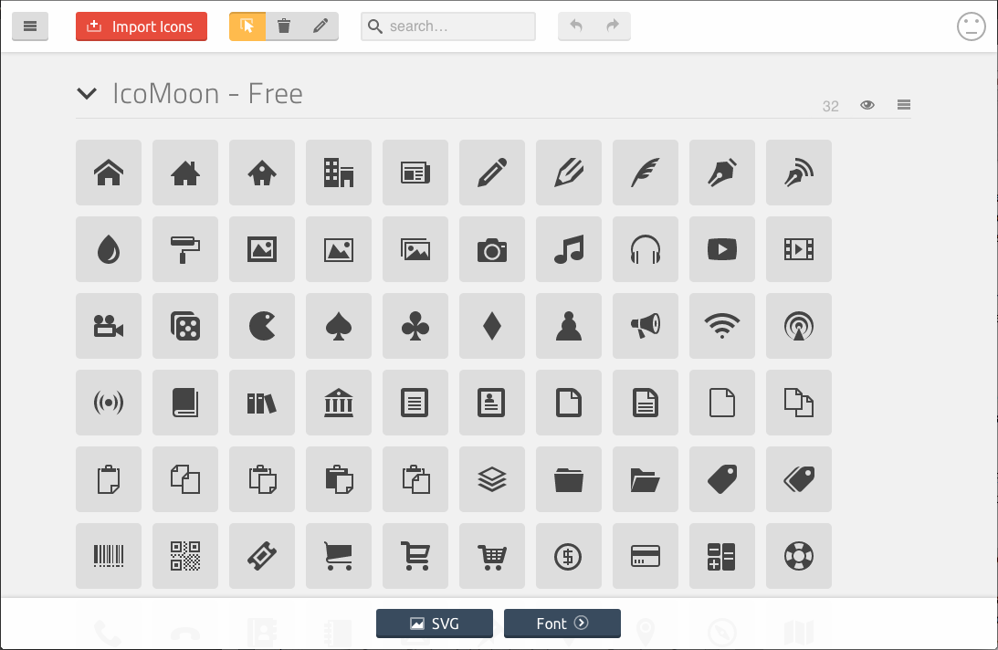
In case you’ve missed it, webfonts are widely being used as a way to display various icons on websites as well. There are many advantages using this method since webfonts use vectors instead of bitmaps to display each icon. This makes such webfonts (also called iconfonts) very lightweight and flexible since they behave as text which is both easily scalable and stylable using plain CSS. Services like IcoMoon enable you to create your own custom icon font using icons from other icon fonts or your own custom vectors in SVG format.
Look under the hood for inspiration
If you’re stuck trying to find a good webfont or webfont combination for your site, you can always seek out for typographic inspiration around the web. A great starting point would be sites that catalog examples of great typography online such as Typ.io or Fonts in use.
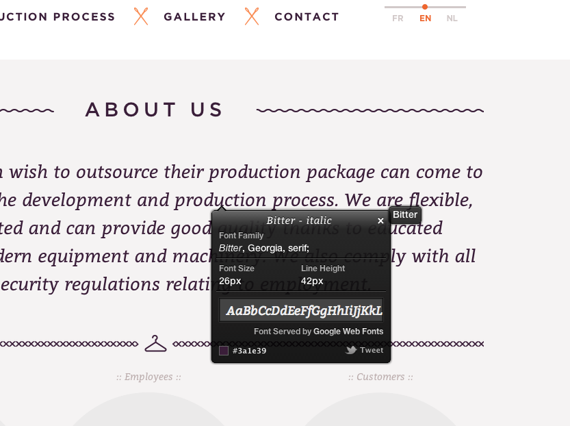
The easiest way to find out what typefaces are being used by a website is to use WhatFont a browser extension/plug-in that lets you click on any selectable type to reveal all kinds of information related to the typography of each block.
System fonts are not that safe anymore.
There are cases where you might want to use a system font, a font that’s available already on the system of your visitors systems, either because you like it better or you have to, because using an external font service is not an option.
Contrary to what you might think, this is not as easy as it used to be. The explosion of smartphone and tablet usage has increased the amount of different devices and operating systems that can potentially access your website and each one of them might have a different set of system fonts.
In those special cases it’s good to have an updated reference such as iOSFonts and TinyType that catalog all the system fonts available on popular systems, and a well crafted fallback list of fonts.
Testing your responsive typography
The advent of responsive design, among other things, bade farewell to the illusion of fixed width viewports and the handfull of screen resolutions and systems you had to consider. Nowadays it's all about fluid containers, high resolution screens and cross-media legibility. Adjusting your web typography to look great under all those unpredictable circumstances may seem impossible at first but fear not, there are plenty of methodologies you can apply especially if you write your CSS using SASS but not all of them are easy to apply.
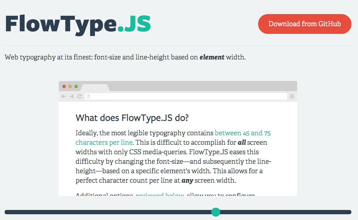
Before delving into media queries and SASS mixins, especially for those new to typography on the web, I would recommend experimenting with Flowtype.js by Simple Focus. Flowtype.js uses javacript to adjust the font size and line height of your text according to the width of a specific container by setting up a few parameters. Although Flowtype.js does not offer the fine-grained control over your typography, a larger and more complex project may require, it does work quite well and it can definitely become a useful prototyping tool to determine the manual adjustments and optimizations you need to make.
And that’s a wrap!
The recent advances on the web have marked a new powerful era for on-line typography and I believe we are still scratching the surface of what can be achieved. But, as always, great power comes with great responsibility and so following some of the best practices and making right use of the available tools and methodologies can help us avoid serious mistakes and dangers that might be hiding around the corner. Be sure to come back as we’ll be posting in-depth articles about some of the topics we covered in this post, along with tutorials and walkthroughs for you to explore and experiment with.