This template comes with two color variations, Light and Dark, plus one fully customisable by you. You can choose the one you like to use through the template parameters under the option Color Variations located in the Template Specific tab.
Frontpage and Categories
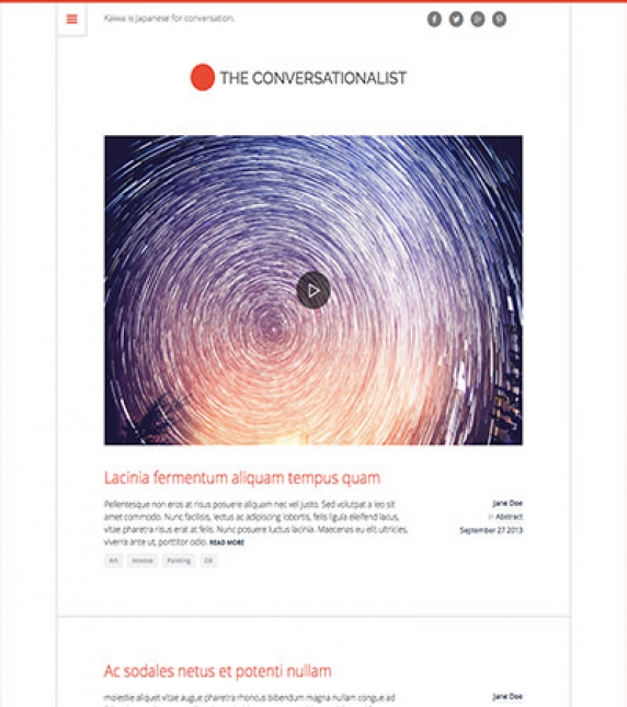
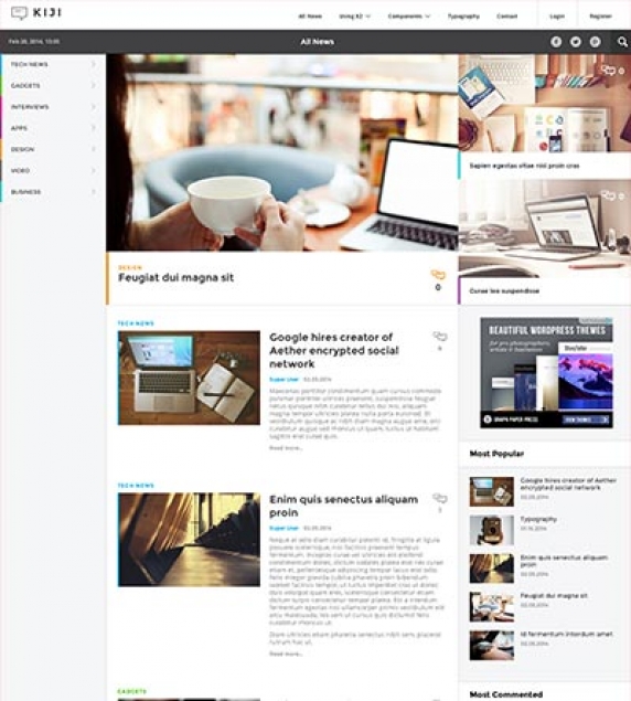
The layout in use is the Default for both Frontpage and Category blog pages. For the list layout we need three Leading items with Large image size photos in a single Column. You can also have four Primary items with the Medium size photos in two Columns as shown in the K2 Category page.
In the K2 category lists you will notice a play button on top of some images. This icon appears only for those items that have a video. The video will be visible once the image is clicked on without leaving the category's page.
.Image Sizes
The following image sizes are recommended for this template:
- XSmall 150
- Small 400
- Medium 600
- Large 900
- XLarge 1200
- Generic 400
- Category Image 400
- Avatar Size 90
- Commenter Image 60
Menu Modules
There are two different menu modules in use, each with a different and unique look & feel. You can either use the horizontal menu (as shown in the K2 Modules page of the demo site) or the overlapping menu (as shown in all other pages). To choose the overlapping menu, just enable the menu module in the theConversationalist_Menu position. To choose the horizontal menu, enable the menu module in the theConversationalist_Horizontal_Menu position.
Module Positions
- theConversationalist_Above_Component
- theConversationalist_Banner120x600
- theConversationalist_Banner160x600
- theConversationalist_Banner300x250
- theConversationalist_Banner468x60
- theConversationalist_Banner728x90
- theConversationalist_Below_Component
- theConversationalist_Bottom
- theConversationalist_Breadcrumbs
- theConversationalist_Component
- theConversationalist_Footer
- theConversationalist_Left
- theConversationalist_Menu
- theConversationalist_Horizontal_Menu
- theConversationalist_Right
- theConversationalist_Search
- theConversationalist_Slideshow
- theConversationalist_Top
Module Suffixes
- .floatLeft, .left adds a float:left to a block.
- .floatRight, .right adds a float:right to a block.
- .text-center adds a center alignment to a block.
- .text-left adds a left alignment to a block.
- .text-right adds a right alignment to a block.
- .text-justify adds a full alignment to a block.
- .alpha removes the left padding of the block.
- .omega removes the right padding of the block.
- .noPadding removes the right and left paddings of the block.
Template Specific Module overrides
K2 Content Modules
- LatestItems
- Slideshow
Please Note: All the module templates are available also for the nuContent extension, for those who choose to use Joomla 's default article system.
Additional Components
Apart from the K2 component we offer CSS styling for the following components
- com_contact
- com_content
- com_users
- com_search
- com_weblinks
- com_newsfeeds
- com_tags (if you are using Joomla 3.x)
Newsletter module
This template uses the TinyLetter Subscribe by JoomlaWorks extension as a newsletter mechanism. All you have to do is open a free account to TinyLetter and add the username in the module parameters.
Commercial Extensions
Simple Image Gallery Pro - After installing it go to the Extension's parameters Layout template for image galleries and choose the one named after the template, i.e. theConversationalist.
The Grid - for developers and enthusiasts
In this template we are using Foundation's 12 column grid with a small variation. You have the default large-xx , small-xx classes but we have also included a medium state (medium-xx) for viewports between 900 and 600pixels and a very-small-xx for viewports below 400pixels.
More info can be found here. http://foundation.zurb.com/docs/components/grid.html
Block Grid - for developers and enthusiasts
We have included Foundation's block grid with some minor alterations and tweeks for the Related items by tag section in the K2 item page. More info can be found here. http://foundation.zurb.com/docs/components/block-grid.html
Visibility Classes - for developers and enthusiasts
If you need complete control over your modules in responsive states we 've got you covered. This template uses the power of the The most advanced responsive front-end framework in the world, ZURB's Foundation.
- .hide-for-small Hides the module in viewports below 767px
- .show-for-small Shows the module in viewports below 767px
- .hide-for-medium Hides the module in viewports above 768px and bellow 1279px
- .hide-for-medium-up Hides the module in viewports above 768px
- .show-for-medium Shows the module in viewports above 768px and bellow 1279px
- .show-for-medium-up Shows the module in viewports above 768px
- .show-for-medium-down Shows the module in viewports below 1279px
- .show-for-large Shows the module in viewports above 1280px and below 1440px
- .show-for-large-up Shows the module in viewports above 1280px
- .hide-for-large Hides the module in viewports above 1280px and below 1440px
- .hide-for-large-up Hides the module in viewports above 1280px
- .show-for-xlarge Shows the module in viewports above 1440px
- .hide-for-xlarge Hides the module in viewports above 1440px
- .show-for-landscape Shows the module in the landscape orientation
- .hide-for-landscape Hides the module in the landscape orientation
- .show-for-portrait Shows the module in the portrait orientation
- .hide-for-portrait Hides the module in the portrait orientation
All these classes are located in the template.css and can be easily expanded and/or edited and can be used for every block of your template.
SASS Support
In the template's /css folder you will find a /src subfolder. There you will find all out .sass files.
We have also used Bourbon which is a simple and lightweight mixin library for Sass.
What is SASS: http://sass-lang.com/
What is Bourbon: http://bourbon.io/
K2.css - for developers and enthusiasts
As you might have noticed this template does not use the default k2.css. We have completely rewritten all the template's styles to be more efficient. In case you download the standalone template package we have included a blank k2.css file in our distribution to avoid 'breaking' you site.
Visual Walkthrough


https://www.joomlaworks.net/blog/itemlist/date/2011/component/pds?start=70#sigProId9b7abd5681
This template comes with six bundled colour variations, plus one fully customisable by you. You can choose the one you like to use through the template parameters under the option Colour Variations located in the Template Specific tab.
Setting up our demo
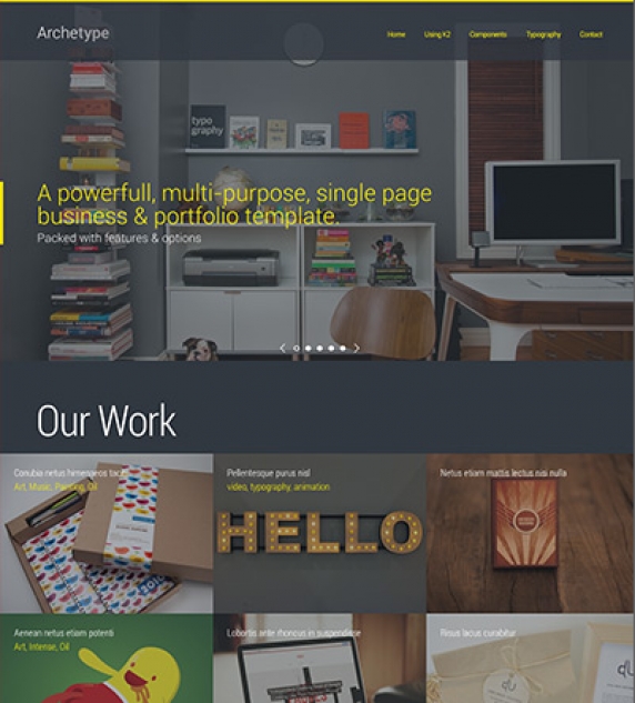
As you can see from the demo site, the frontpage consists of K2 modules. For the component view there are two available views you can choose. One is the blog view and the other the portfolio gridded view.
The Front-page
There are numerous options and module positions to use for your frontpage. You can advise the Visual Walktrough in order to check and identify all available module positions for each of the elements you see in the demo's frontpage.
Using the Homepage settings
Through these settings you can enable or disable two specific blocks to show or not in your frontpage only. These blocks contain the Moto and Tagline (you have to enter them under the Standard tab in the Template parameters) and a dynamically generated scrolling menu according your published modules in this page.
Slideshow Settings
For the Slideshow module we have also setup some extra parameters in order to provide you more flexibility.
You can control the slideshow’s animation speed, the time interval, as well as the image ratio through the Slideshow Settings section under the Template Specific tab in the Template parameters.
An example: Let’s say you have 640x480 sized images and you want the slide to remain visible for five seconds while the animation lasts for one second.
In this case you need to select the 4/3 image ratio, 5000 as the interval time and 1000 as the animation speed. All time settings should be in milliseconds.
Portfolio Settings - Module Parameters Limit
Through the template’s parameters you can also control the limit of the the items that are initially loaded in the "Our Work" and "Case studies" modules. The default limit is 6.
Portfolio Settings - Image ratio
One important setting is the image's dimension ratio. You can globally control both your module's and component’s image dimension ratio. This means that you can have images with equal heights for your portfolio and case study modules, as well as, your portfolio K2 category.
Using the highlight section
In the demo site you might have noticed the "Services" section. This section, which appears in the frontpage only, can be enabled and edited through the Highlight section of the Template’s parameters.
In this section you can enter or edit each block’s title, description, link, and icon or image.
Note that for all icons, both in this section and throughout the template, we are using icon fonts so your site will be both lightweight and retina ready
Custom headers
Gor the Highlights section "Services", described above, and the Footer three block section, "Contact", the titles can be applied/changed through the Custom Headers section in the Template's parameters.
Custom modules
The Contact Information module - http://extensions.joomla.org/extensions/contacts-and-feedback/contact-details/1681 has been used for creating the module in the footer.
Menu Modules
This template uses two different menu modules. The default one, which is the one you see in the demo site and the one that is enabled in the quick start package, and the horizontal. You can use the horizontal menu by simply publishing your module at the archetype_Menu2 position. You can use both menus for your site's main navigation, although not at the same time.
K2 General Settings
For this template's layout we have used only the Leading items. You can use the primary or secondary items, as well, if you want to further separate the grid. All item views use the Large image size.
Blog Layout
The blog layout uses it's own K2 category settings. For the demo site, we have used four Leading items with Large sized image in a single column.
Portfolio Layout
For the portfolio layout we have used fifteen Leading items with Medium sized images in three columns.
Extra Fields
This template offers several extra field groups. One group, called "User Details" in the quickstart package, is for personal info and links towards social profiles. You can see these fields in "Our team" module. Another one, used in the Blog K2 category of the quickstart package, called "Article", is used to provide a subtitle in the K2 items and finally, the other two groups, cover your portfolio's needs. The noteworthy field is the "Additional Information" field. You can use this to add additional images or additional galleries in your portfolio items.
Using the contact form in your template like the demo site.
In our demo site you might have noticed that we have included a contact form in the footer. To embed a similar contact form you need to follow these simple steps.
Setup a menu with a contact menu item (like the quickstart package).
In the module parameters you need to specify a menu ID. This id will trigger the functionality and open the contact form. You need the "actionMenu" id.
Now you need one final setting which is equally important and should not be skipped.
In the single contact parameters you need to specify and manually enter the Contact Redirect setting. Normally this would be the menu item’s link with &tmpl=component at the end.
Example Link: index.php?option=com_contact&view=contact&id=1&tmpl=component
Image Sizes
The following image sizes are recommended for this template:
- XSmall 100
- Small 200
- Medium 600
- Large 900
- XLarge 900
- Generic 900
- Category Image 100
- Avatar Size 100
- Commenter Image 100
Module Positions
- Archetype_Menu
- Archetype_Menu2
- Archetype_Sidebar
- Archetype_Slideshow
- Archetype_Component
- Archetype_Under_Component
- Archetype_Content_1
- Archetype_Content_2
- Archetype_Content_3
- Archetype_Content_4
- Archetype_Over_Footer
- Archetype_Footer_1
- Archetype_Footer_2
- Archetype_Footer_3
- Archetype_Footer_Full
Module Suffixes
- .left adds a float:left to a block.
- .right adds a float:right to a block.
- .text-center adds a center alignment to a block.
- .text-left adds a left alignment to a block.
- .text-right adds a right alignment to a block.
- .text-justify adds a full alignment to a block.
- .colourHeader adds a yellow color to the module's header.
- .inlineTitle places the module's title inline with the module's content.
Template Specific Module overrides
K2 Content Modules
- 3BlockGrid
- BlogList
- CaseStudy
- Clientelle
- Portfolio
- Slideshow
- Testimonials
Additional Components
Apart from the K2 component we offer CSS styling for the following components:
- com_users
- com_search
- com_weblinks
- com_newsfeeds
- com_tags (if you are using Joomla 3.x)
Commercial Extensions
Simple Image Gallery Pro - After installing it go to the Extension's parameters Layout template for image galleries and choose the one named after the template, i.e. Archetype.
The Grid - for developers and enthusiasts
We are using ZURB's foundation grid for this template. You can find out more about foundation here: http://foundation.zurb.com/
Block Grid - for developers and enthusiasts
We have included Foundation's block grid with some minor alterations and tweeks for modules like the category listings.
More info can be found here. http://foundation.zurb.com/docs/components/block-grid.html
Module Grid - for developers and enthusiasts
For best results and for maximum control over your responsive layout we have developed a small grid for your sidebar's (mostly) modules.
For the viewports between 900 and 569 pixels you can use the medium-module-1 to medium-module-12 (medium-module-6 for 50% width) as a module suffix.
Visibility Classes - for developers and enthusiasts
If you need complete control over your modules in responsive states we 've got you covered. This template uses the power of the The most advanced responsive front-end framework in the world, ZURB's Foundation.
- .hide-for-small Hides the module in viewports below 767px
- .show-for-small Shows the module in viewports below 767px
- .hide-for-medium Hides the module in viewports above 768px and bellow 1279px
- .hide-for-medium-up Hides the module in viewports above 768px
- .show-for-medium Shows the module in viewports above 768px and bellow 1279px
- .show-for-medium-up Shows the module in viewports above 768px
- .show-for-medium-down Shows the module in viewports below 1279px
- .show-for-large Shows the module in viewports above 1280px and below 1440px
- .show-for-large-up Shows the module in viewports above 1280px
- .hide-for-large Hides the module in viewports above 1280px and below 1440px
- .hide-for-large-up Hides the module in viewports above 1280px
- .show-for-xlarge Shows the module in viewports above 1440px
- .hide-for-xlarge Hides the module in viewports above 1440px
- .show-for-landscape Shows the module in the landscape orientation
- .hide-for-landscape Hides the module in the landscape orientation
- .show-for-portrait Shows the module in the portrait orientation
- .hide-for-portrait Hides the module in the portrait orientation
All these classes are located in the template.css and can be easily expanded and/or edited and can be used for every block of your template.
SASS Support
In the template's /css folder you will find a /src subfolder. There you will find all out .sass files.
We have also used Bourbon which is a simple and lightweight mixin library for Sass.
What is SASS: http://sass-lang.com/
What is Bourbon: http://bourbon.io/
K2.css - for developers and enthusiasts
As you might have noticed this template does not use the default k2.css. We have completely rewritten all the template's styles to be more efficient. In case you download the standalone template package we have included a blank k2.css file in our distribution to avoid 'breaking' you site.
Visual Walkthrough


https://www.joomlaworks.net/blog/itemlist/date/2011/component/pds?start=70#sigProId134a4035ec
This template comes with six color variations, plus one fully customisable by you. You can choose the one you like to use through the template parameters under the option Color Variations located in the Template Specific tab.
For this template we have also used the Radiojar's radio service for the Player and alternatively for OnAir, Schedule and Dj's list modules which have also been setup for K2. Read here more about Radiojar.
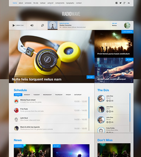
The Frontpage
The Frontpage of this demo site consists of modules. In the order we see them from top to bottom we have:
- Horizontal menu or off-canvas menu,
- Player and onAir module, which come from Radiojar service,
- Featured items module,
- Schedule and Dj's coming from K2 (are also available for Radiojar which are shown under the radiojar page),
- News
- Agenda
- Sidebar: Don't miss, Newsletter, Soundcloud Latest mix
- Bottom: About, Custom Menu, Contact Info, Quote.
The Blog Category
The layout in use is the Default for the Blog Category. For the list layout we need four Leading items with Large sized images in a single Column.
In the K2 Blog category lists you will notice a play button on top of some images. This icon appears only for those items that have a video. The video will be visible once the image is clicked on without leaving the category's page.
The Grid Category (The Dj's)
The layout in use for this category is grid. For the list layout we need seven Primary items with Medium sized images in a four column grid. The number of items is odd because the first item is taken by the category block.
Schedule Category
The layout in use for this specific category is schedule. For this layout we need only seven Leading items. These items will correspond to each day of the week starting from Sunday. It is important to use Ordering as the item's ordering setting. The only parameters we need enabled for this category is the item's title and the extra fields. Read more about this category's extra fields setup under the Extra fields section of this page.
Popup Player and setup
We have used another sub-template file to setup this popup player and additional information. It consists of three tabs. The first one has the Player and onAir information along with a 300x250 banner and social links. the second one has the Schedule and the third one the list of Dj's. All the information provided in these tabs are instances of the already used modules with the prefix RadioWave_Popup_, in order to stand out.
You will probably notice the "Also in MP3, M3U" links in the popup's footer. These two links can be setup from the template parameters under the Template Specific section. Check the visual walkthrough in order to see each module's settings.
Using a different radio service provider or your own streaming server (e.g. IceCast/ShoutCast)
Not using Radiojar? No problem.
Both players in the quickstart package are just HTML snippets which can easily be replaced with your own players/streams in the respective K2 Tools type modules.
If you specifically have an IceCast or ShoutCast stream server, then you can use the RadioWave Generic Player, our ready-made module for these types of streaming servers. Info & download at: https://github.com/joomlaworks/radiowave-generic-player
Extra Fields
For better content management we have set up some Extra Fields that are associated with specific categories.
Let's start with the extra field used in the Don't Miss module. We have used a Tagline extra field to add this extra infrormation needed for this module. This extrafield is assigned to Events, Concert, Dj Set, Live Events categories.
The "Producer Additional Info" extra fields group is assigned to the Dj's category. It consists of three social links and a nickname as the additional information for each dj which is used both in the dj's item page and the dj's module list.
The "Schedule" extra fields group is assigned to the Schedule category. It consists of twelve, two-hour set of: the show's start and end time, the dj's avatar, the show's title and tagline as well as the show's cover image. Each set of extra fields is marked with the postfix _a, _b, _c, etc. up to _l on each extra field's alias.
Image Sizes
The following image sizes are recommended for this template:
- XSmall 100
- Small 200
- Medium 400
- Large 600
- XLarge 900
- Generic 400
- Category Image 100
- Avatar Size 100
- Commenter Image 60
Menu Modules
There are two different menu modules in use, each with a different and unique look & feel. You can either use the horizontal menu or the off-canvas menu. To choose the off-canvas menu, just enable the menu module in the RadioWave_Menu position. To choose the horizontal menu, enable the menu module in the RadioWave_Horizontal_Menu position.
Module Positions
- RadioWave_AboveComponent_1
- RadioWave_AboveComponent_2
- RadioWave_Banner120x600
- RadioWave_Banner160x600
- RadioWave_Banner300x250
- RadioWave_Banner468x60
- RadioWave_Banner728x90
- RadioWave_BelowComponent
- RadioWave_Bottom
- RadioWave_Breadcrumbs
- RadioWave_Component
- RadioWave_ContactInfo
- RadioWave_Footer
- RadioWave_Header
- RadioWave_Left
- RadioWave_Menu
- RadioWave_HorizontalMenu
- RadioWave_Right
- RadioWave_Player
- RadioWave_Search
- RadioWave_Slideshow
- RadioWave_SocialLinks
- RadioWave_Top
- RadioWave_Popup_Player
- RadioWave_Popup_Sidebar
- RadioWave_Popup_Schedule
- RadioWave_Popup_Djs
Module Suffixes
- .left adds a float:left to a block.
- .right adds a float:right to a block.
- .text-center adds a center alignment to a block.
- .text-left adds a left alignment to a block.
- .text-right adds a right alignment to a block.
- .text-justify adds a full alignment to a block.
- .alpha removes the left padding of the block.
- .omega removes the right padding of the block.
- .noPadding removes the right and left paddings of the block.
- .noMargin removes the margin in a block.
- .borderRight adds a black right border with 60% opacity to a block.
- .whiteOpacity90 adds a 90% opacity in a block.
- .whiteOpacity80 adds an 80% opacity in a block.
- .greyBg adds a grey background in a block.
Template Specific Module overrides
K2 Content Modules
- 2BlockGrid
- Agenda
- Djs-Scroller
- DontMiss
- Featured
- LatestItems
- onAir
- Schedule
Additional Components
Apart from the K2 component we offer CSS styling for the following components:
- com_contact
- com_content
- com_users
- com_search
- com_weblinks
- com_newsfeeds
- com_tags
Radiojar
We have used Radiojar's streaming radio service for our player along with widgets for the onAir, Schedule and DJ lists module. All the javascript code that each of these modules need is slightly customized and located in the /templates/radiowave/js/radiojar.js file in the template.
To add your stream's id simply open the /templates/radiowave/js/radiojar.js file with a text editor and replace Radiojar's default ID (u0510s7hb) used for demos with the actual ID provided for your account by Radiojar.
Make sure to keep the HTML structure of each module intact if you choose to use this service. Don't forget to change the popup's url in order to correspond your site's url path in the Schedule module.
Newsletter module
This template uses the TinyLetter Subscribe (by JoomlaWorks) extension which integrates the awesome (and free) TinyLetter newsletter service (powered by MailChimp) with Joomla. All you have to do is open a free account on TinyLetter and add the username you'll create there in the module's parameters.
The Contact Information module
In this template we have used the 3rd party (free) Contacts Information Mod module for creating the "Contact us" block at the footer of the site.
Commercial Extensions
Simple Image Gallery Pro - After installing it go to the Extension's parameters Layout template for image galleries and choose the one named after the template, i.e. RadioWave.
The Grid - for developers and enthusiasts
In this template we are using Foundation's custom 16 column grid. More info can be found here: https://get.foundation/sites/docs-v5/components/grid.html
Block Grid - for developers and enthusiasts
We have included Foundation's block grid with some minor alterations and tweeks for the "Related Items By Tag" section in the K2 item view. More info can be found here: https://get.foundation/sites/docs-v5/components/block_grid.html
Visibility Classes - for developers and enthusiasts
If you need complete control over your modules in responsive states we 've got you covered. This template uses the power of the The most advanced responsive front-end framework in the world, ZURB's Foundation.
- .hide-for-small Hides the module in viewports below 767px
- .show-for-small Shows the module in viewports below 767px
- .hide-for-medium Hides the module in viewports above 768px and bellow 1279px
- .hide-for-medium-up Hides the module in viewports above 768px
- .show-for-medium Shows the module in viewports above 768px and bellow 1279px
- .show-for-medium-up Shows the module in viewports above 768px
- .show-for-medium-down Shows the module in viewports below 1279px
- .show-for-large Shows the module in viewports above 1280px and below 1440px
- .show-for-large-up Shows the module in viewports above 1280px
- .hide-for-large Hides the module in viewports above 1280px and below 1440px
- .hide-for-large-up Hides the module in viewports above 1280px
- .show-for-xlarge Shows the module in viewports above 1440px
- .hide-for-xlarge Hides the module in viewports above 1440px
- .show-for-landscape Shows the module in the landscape orientation
- .hide-for-landscape Hides the module in the landscape orientation
- .show-for-portrait Shows the module in the portrait orientation
- .hide-for-portrait Hides the module in the portrait orientation
All these classes are located in the template.css and can be easily expanded and/or edited and can be used for every block of your template.
k2.css - for developers and enthusiasts
As you might have noticed this template does not use the default k2.css. We have completely rewritten all the template's styles to be more efficient. In case you download the standalone template package we have included a blank k2.css file in our distribution to avoid 'breaking' you site. All required CSS rules for K2 are embedded in the main template.css file.
Visual Walkthrough


https://www.joomlaworks.net/blog/itemlist/date/2011/component/pds?start=70#sigProId1dda1f7184
This template comes with five bundled colour variations, plus one fully customisable by you. You can choose the one you like to use through the template parameters under the option Colour Variations located in the Template Specific tab.
Setting up our demo
As you can see, our template, in the frontpage only uses K2 modules instead of the component view. As for the component view you can choose between the blog view or the gridded view which is used in the speakers and conference pages.
The Front-page and module positions
As stated above you have numerous options and module positions to choose from for your frontpage.
There are three module positions placed one below the other so you can order your content more effectively.
Furthermore, there is a module position in the component area if you choose to use modules instead of the component.
Finally, there are positions above the component area and two half width positions located in the footer.
Template functionality
From the template’s settings, apart from the colours, you can also control most of the template’s functionality.
You can control the homepage’s settings, the countdown timer, the content highlights (conference section in the demo) and finally the background image settings.
Background image
You can select the background image from the template’s parameters. However in K2 views (item and category) the K2 image will be used instead. In all other components the template’s image will be used.
Using the Homepage settings
From these fields you can modify the content and image (or video) of your homepage’s header.
Using images in the homepage:
All you need to do is to specify an image in the appropriate field. (Check the visual walkthrough)
Using video in the homepage:
Bellow the image field there is a textfield. You need to paste the iframe code in there.
Hint: In order to work correctly you need to paste the iframe code with a specified width and height.
Eg. This is the default code from vimeo:
<iframe src="//player.vimeo.com/video/85525224" width="500" height="281" frameborder="0" webkitallowfullscreen mozallowfullscreen allowfullscreen></iframe>
As you can see you can safely use this since width="" height="" are defined by default.
Hint: Some versions of flash in older Operating systems disregard completely any z-index values. If you are using a video from YouTube you need to add a parameter to the URL to fix this.
If you are using multiple parameters (your URL looks like youtube.com/embed/VIDEOID?param=2¶m ) add &wmode=transparent. If not add ?wmode=transparent.
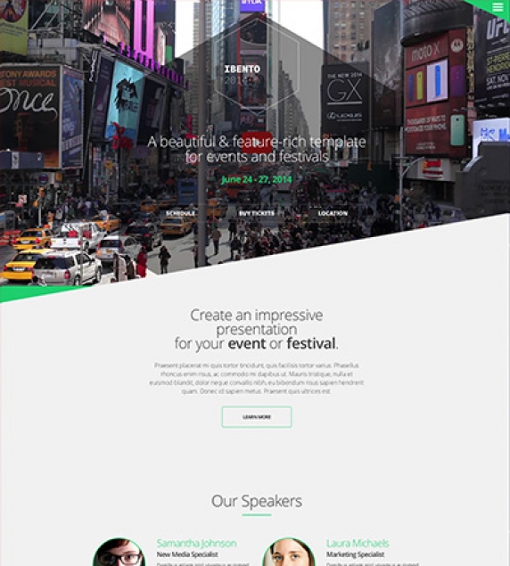
Highlight section
In the demo site you might have noticed the "Conference" section.
This section, which appears only in the frontpage, can be enabled and edited through the Highlight section of the template’s parameters.
In this section, you can enter or edit each block’s title, description, link, if you need to, and finally choose between an icon or an tagline. You can also specify the main title of that section, the main link and the colour of the pie charts.
The only different element is the Percentage field. Filling it with a number from 1 - 100 will animate the pie chart to that percentage.
Hint for developers and enthusiasts: You can see all the available options for the pie charts here: http://rendro.github.io/easy-pie-chart/
Countdown timer
You can control the countdown timer’s settings from the template’s parameters. All you need to do is to is to specify the date and/or time your event is staring.
Hint: Remember to use the YYYY/MM/DD and HH:MM:SS formats.
Flickr integration
In order to use Flickr’s functionality you need to create a free API key. You can get your free API key from: http://www.flickr.com/services/apps/create/
Flickr integration - module
In this template we are using the FlickrSetEmbedder script. You can find detailed documentation here: http://fotis.co/projects/flickrsetembedder.js/
As for the template, all you need to do is paste the following snippet in K2 Tools/ Custom HTML module
<a data-source="flickr" data-limit=“6" href=“YOUR_FLICKR_SET_URL">Check out my cool Flickr set</a>
You can find another example of the snippet in the demo package (K2 Tools module).
Custom modules
The Contact Information module - http://extensions.joomla.org/extensions/contacts-and-feedback/contact-details/1681 has been used for creating the module in the footer.
Newsletter Module
This template uses the TinyLetter Subscribe by JoomlaWorks extension as a newsletter mechanism. All you have to do is open a free account to TinyLetter and add the username in the module parameters.
Menu Modules
This template uses three different menu modules. The default one, the one you see at the demo site which is also enabled in the quick start package, which is the off canvas menu. You can use a typical horizontal menu, as well. Simply publish your module at the ibento_Alternate_Menu position.
Using the social menu
The social menu (the one placed on the footer) uses its own overrides. You need to choose the appropriate layout for the module’s settings. You can do this by selecting the “social” option from the Alternate Layout select box.
Finally don’t forget to set the appropriate CSS class (Link CSS Style). The class should be the name of the network, e.g. facebook, twitter, google-plus, vimeo etc.
Secondary Menu
Apart from the two main menus there is another menu module which you can see in the homepage’s header.
In order to use that menu you have to publish a module at the ibento_Secondary_Menu position.
Hint: Due to the header’s design that menu cannot display any submenu items.
Secondary Menu in smaller viewports
In the demo site we have used visibility classes to display another menu module outside the header.
In this case you need to make sure that apart from the visibility class you have also used the "secondary-outer-nav" module suffix.
For further assistance make sure you check the quick start package and the visual walkthrough.
Switching between Menus
You can use both main menus for your site's main navigation, although not at the same time.
K2 Categories and Templates
In this template we have used two different layouts and K2 templates.
One for our blog listing and one for our grid listing. You can see them in action on the blog category and on the Speakers/ Conference categories.
Blog Layout
The blog template uses it's own K2 category settings. You can change or browse through these settings. In our demo we are using the large image for both the item list and the item views. Finally for this layout we are only using leading items in a single columned grid.
Grid Layout
For this layout apart from the Grid template we are using completely different settings for our category listings and item views (see the visual walkthrough). We are using eight items in a four column grid with medium sized images. In smaller viewports the grid will break down to a two or a single columned layout.
Extra Fields
This template offers two extra field groups. One group is for personal info and links towards social profiles. You can see these fields in the Speaker’s profile items.
The other group covers your event. There is a field for a map (preferably google map’s iframe code) and a field for the venue’s address.
Extra Fields module - Venue details
In the demo package there is a K2 Content module which displays the map, the image and the address of the venue.
In order to duplicate that functionality you need to fill in these fields (in the item view) and then publish a K2 Content module using the Venue sub-template. Make sure you select that item as the source of the module’s content and set the extra fields to be visible.
Image Sizes
The following image sizes are recommended for this template:
- XSmall 100
- Small 200
- Medium 400
- Large 900
- XLarge 1280
- Generic 900
- Category Image 1200
- Avatar Size 100
- Commenter Image 102
Module Positions
- ibento_Menu
- ibento_Secondary_Menu
- ibento_Alternate_Menu
- ibento_Hero
- ibento_Above_Component
- ibento_Component
- ibento_Breadcrumbs
- ibento_Right
- ibento_Under_Component_1
- ibento_Under_Component_2
- ibento_Under_Component_3
- ibento_Under_Half_1
- ibento_Under_Half_2
- ibento_Footer
Module Suffixes
- .left adds a float:left to a block.
- .right adds a float:right to a block.
- .text-center adds a center alignment to a block.
- .text-left adds a left alignment to a block.
- .text-right adds a right alignment to a block.
- .text-justify adds a full alignment to a block.
- .list-with-image for K2 Content modules with images.
- .list-without-image for K2 Content modules without images.
- .title-on-left moves the module title to the left.
Template Specific Module overrides
For the K2 Content modules the following sub-templates are available.
2Column which is used in the speakers modules.
Venue which displays the map and the address extra fields.
The default one which can be used for listing with or without an image (see the Module Suffixes section).
Additional Components
Apart from the K2 component we offer CSS styling for the following components:
- com_users
- com_search
- com_weblinks
- com_newsfeeds
- com_tags (if you are using Joomla 3.x)
Commercial Extensions
Simple Image Gallery Pro - After installing it go to the Extension's parameters Layout template for image galleries and choose the one named after the template, i.e. ibento.
The Grid - for developers and enthusiasts
We are using ZURB's foundation grid for this template. You can find out more about foundation here: http://foundation.zurb.com/
Block Grid - for developers and enthusiasts
We have included Foundation's block grid with some minor alterations and tweeks for modules like the category listings.
More info can be found here. http://foundation.zurb.com/docs/components/block-grid.html
Module Grid - for developers and enthusiasts
For best results and for maximum control over your responsive layout we have developed a small grid for your sidebar's (mostly) modules.
For the viewports between 900 and 569 pixels you can use the medium-module-1 to medium-module-12 (medium-module-6 for 50% width) as a module suffix.
Visibility Classes - for developers and enthusiasts
If you need complete control over your modules in responsive states we 've got you covered. This template uses the power of the The most advanced responsive front-end framework in the world, ZURB's Foundation.
- .hide-for-small Hides the module in viewports below 767px
- .show-for-small Shows the module in viewports below 767px
- .hide-for-medium Hides the module in viewports above 768px and bellow 1279px
- .hide-for-medium-up Hides the module in viewports above 768px
- .show-for-medium Shows the module in viewports above 768px and bellow 1279px
- .show-for-medium-up Shows the module in viewports above 768px
- .show-for-medium-down Shows the module in viewports below 1279px
- .show-for-large Shows the module in viewports above 1280px and below 1440px
- .show-for-large-up Shows the module in viewports above 1280px
- .hide-for-large Hides the module in viewports above 1280px and below 1440px
- .hide-for-large-up Hides the module in viewports above 1280px
- .show-for-xlarge Shows the module in viewports above 1440px
- .hide-for-xlarge Hides the module in viewports above 1440px
- .show-for-landscape Shows the module in the landscape orientation
- .hide-for-landscape Hides the module in the landscape orientation
- .show-for-portrait Shows the module in the portrait orientation
- .hide-for-portrait Hides the module in the portrait orientation
All these classes are located in the template.css and can be easily expanded and/or edited and can be used for every block of your template.
SASS Support
In the template's /css folder you will find a /src subfolder. There you will find all out .sass files.
We have also used Bourbon which is a simple and lightweight mixin library for Sass.
What is SASS: http://sass-lang.com/
What is Bourbon: http://bourbon.io/
K2.css - for developers and enthusiasts
As you might have noticed this template does not use the default k2.css. We have completely rewritten all the template's styles to be more efficient. In case you download the standalone template package we have included a blank k2.css file in our distribution to avoid 'breaking' you site.
/template/documentation/galleries/Visual Walkthrough


https://www.joomlaworks.net/blog/itemlist/date/2011/component/pds?start=70#sigProId897793f5ba
Setting up our Demo
This template offers a versatile layout with three columns and multiple module areas placed under the component, four footer modules and finally a module position for your hero/ slideshow module.
Due to the nature of the site both sidebars (left and right) have two module areas. This give you ultimate control over your content. If you use the kiwi_Right_Lower position in larger screens (1500px and above) a fifth column will appear, displaying the sidebar modules in two columns instead of one.
Template functionality.
From the template’s settings view apart from the colours, you can also control most of the template’s functionality.
- You can select each category’s main colour.
- Specify a fixed site width
- Enable the heading and the date on the header (see the demo)
- Use your own colour variations
- Enter your social links
Setting the site width
As you can see from the demo page the site will extend to the full width of the viewport. The layout will stretch from a one to a five columned layout depending on the screen size.
You can easily change this option and specify your site’s width by simply enabling the option in the template’s parameters.
Make sure you follow the instructions and enter a value in pixels. For more information please see the visual walkthrough.
Setting up the menus.
This is a template designed to support multiple menus with each one being different.
Setting up and using the main menu
This part is really straightforward. Simply publish a menu module in the kiji_Menu position.
If you want a menu similar to the demo site then read the “Hiding the main menu on smaller viewports” section bellow.
Using the mega menu
Using the mega menu is very easy. Publish your menu module at the kiji_MegaMenu position and use the secondary-menu suffix.
Now all you need to do it publish a module, there is a K2 Content template for these modules, for each sub-menu item.
Go to Menus -> (Your Menu name ) select the menu item you wish to have a lower level and write down its id.
The id is the last part of the URL e.g. of xxxx: id=100 keep the 100. Then publish a module at the mega-menu-item- position. In this case the position would be mega-menu-item-100. The visual walkthrough contains images of this procedure.
Using a custom menu
Several custom menus appear on the demo site. The App menu and custom menus are both Joomla menus.
Use the custom-menu module suffix if you want your menu links to be underlined like the demo.
Using the login/ register menu
Another feature of this template is the login menu and the kiji_Login_Menu module position. This is a small menu which due to space restriction can ideally contain only a link to login or to register to the site.
Hint: If you want your menu links to turn into icons in smaller screens you can use the register-link and login-link CSS classes.
Using a social menu
The social menu (the one placed on the footer) uses its own overrides. You need to choose the appropriate layout for the module’s settings. You can do this by selecting the “social” option from the Alternate Layout select box.
Finally don’t forget to set the appropriate CSS class (Link CSS Style). The class should be the name of the network, e.g. facebook, twitter, google-plus, vimeo etc.
Hiding the main menu on smaller viewports (Like the demo).
If you want to have your main menu in two different module areas like the demo site you have to follow these simple steps.
1) To hide the main menu module area from smaller viewports you need to enablet the “Hide the main menu in smaller viewports” setting from the template params.
2) Then you need to publish your menu module in another position e.g. in the Kiji_Left position like demo.
3) Finally use the show-for-medium-down module suffix to hide the module in larger viewports.
K2 Content and Categories setup
Using the leading items
This template uses a specific template for leading items (category_item_leading.php). This template is different from the rest of the item listings. It hides several elements like the intro text and it uses another layout and image size. It’s image is much larger and stretches from end to end while the text is enclosed in a white box with a coloured border. If you do not want this layout or your content does not consist of larger images then you should probably not use any leading items.
Using the primary items
Primary items are used throughout the site. They have the typical blog/portal look and feel. The medium image size is suggested since the image will be floated to the left.
Using the secondary items
Secondary items once again have are different. They also use a different template - category_item_grid.php. From the template name it is clear that these items are intended to be used if you want a gridded layout instead of a blog layout.
Example:
In the homepage we are using one leading item. This it the first item which has a full sized (large) image. We are also using four “normal” items, these are all primary items with medium sized images.
K2 Content module templates
- 2ColWithImages - Used in the homepage, the two columned module with background images.
- Default - The default item listing.
- Hero - The two columned module above the main component area.
- Masonry - The “Quick Reads” modul, uses the Masonry jQuery plugin.
- MegaMenuItem - The module for the mega menu items.
- ReadThis -The template for the "Read this" module.
- Slider - The slider used for the “Latest Reviews” module.
- Video - The main video module. Clicking on the image will start the video.
- VideoSidebar - Similar module but with no video playing functionality.
Module positions
- kiji_Menu
- kiji_Login_Menu
- kiji_MegaMenu
- kiji_Search
- kiji_Left
- kiji_Right
- kiji_Hero
- kiji_Component
- kiji_Under_Component_1
- kiji_Under_Component_2
- kiji_Under_Component_3
- kiji_Under_Component_4
- kiji_Under_Component_5
- kiji_Under_Component_6
- kiji_Above_Footer
- kiji_Footer_1
- kiji_Footer_2
- kiji_Footer_3
- kiji_Footer_4
Image Sizes
The following image sizes are recommended for this template:
- XSmall 100
- Small 200
- Medium 320
- Large 900
- XLarge 1200
- Generic 320
- Category Image 100
- Avatar Size 150
- Commenter Image 112
Module Suffixes
- .left adds a float:left to a block.
- .right adds a float:right to a block.
- .text-center adds a center alignment to a block.
- .text-right adds a right text alignment to a block.
- .text-left adds a left text alignment to a block.
Module headers
The "Quick Reads”, “Read This” and “Latest reviews” modules use icons as a part of their headers. To use these icons you have to use there module suffixes:
- loading-header
- phone-header
- eye-header
- Additional Components
Apart from the K2 component we offer CSS styling for the following components
com_contact (form only)
com_users ( all views )
com_search
com_weblinks
com_newsfeeds
Commercial Extensions
Simple Image Gallery Pro - After installing it go to the Extension's parameters Layout template for image galleries and choose the one named after the template, i.e. getK2.
For developers and enthusiasts
The Grid
We are using ZURB's foundation grid for this template. You can find out more about foundation here: http://foundation.zurb.com/
Addtionally we have added a grid for larger (xl) and very large (xxl) viewports.
Block Grid
We have included Foundation's block grid.
More info can be found here. http://foundation.zurb.com/docs/components/block-grid.html
Visibility Classes
If you need complete control over your modules in responsive states we 've got you covered. This template uses the power of the The most advanced responsive front-end framework in the world, ZURB's foundation.
.hide-for-small Hides the module in viewports bellow 767px
.show-for-small Shows the module in viewports bellow 767px
.hide-for-medium Hides the module in viewports above 768px and bellow 1279px
.hide-for-medium-up Hides the module in viewports above 768px
.show-for-medium Shows the module in viewports above 768px and bellow 1279px
.show-for-medium-up Shows the module in viewports above 768px
.show-for-medium-down Shows the module in viewports bellow 1279px
.show-for-large Shows the module in viewports above 1280px and bellow 1440px
.show-for-large-up Shows the module in viewports above 1280px
.hide-for-large Hides the module in viewports above 1280px and bellow 1440px
.hide-for-large-up Hides the module in viewports above 1280px
.show-for-xlarge Shows the module in viewports above 1440px
.hide-for-xlarge Hides the module in viewports above 1440px
.show-for-landscape Shows the module in the landscape orientation
.hide-for-landscape Hides the module in the landscape orientation
.show-for-portrait Shows the module in the portrait orientation
.hide-for-portrait Hides the module in the portrait orientation
All these classes are located in the template.css and can be easily expanded and/or edited and can be used for every block of your template, not just your modules.
More info can be found here: http://foundation.zurb.com/docs/components/visibility.html
Icon Fonts
We have included the Entypo family from fontello.com and the drip icon font family http://demo.amitjakhu.com/dripicons/ in this template. The stylesheet is embedded with the main template.css file.
k2.css
As you might have noticed this template does not use the default k2.css. We have completely rewritten all the template's styles to be more efficient. In case you download the standalone template package we have included a blank k2.css file in our distribution to avoid 'breaking' you site.
SASS
In your template's /css folder you will find a /src subfolder. There you will find all out .sass files.
We have also used Bourbon which is a simple and lightweight mixin library for Sass
What is SASS: http://sass-lang.com/
What is Bourbon: http://bourbon.io/
Visual Walkthrough


https://www.joomlaworks.net/blog/itemlist/date/2011/component/pds?start=70#sigProId43474fa51a
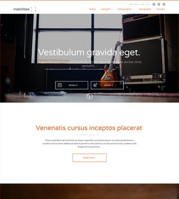
Setting up our Demo
As you can see our template in the frontpage only uses K2 modules instead of the component view. As for the component view you can choose between the blog view, the gridded view to the small image on the left views.
The Front-page and module positions
As stated above you have numerous options and module positions to choose from for your front page.
There are five module positions placed one bellow the other so you can order your content more effectively.
Furthermore there is a module position in the component area if you choose to use modules instead of the component.
Finally there are positions above the component area (Hero unit) a sidebar and three positions next to each other in the footer.
Template functionality
From the template’s settings view apart from the colours, you can also control most of the template’s functionality.
- Choose between a fixed or a static menu
- Choose between off canvas and normal navigation
- Choose between coloured and “white coloured” navigation
- Choose the background image of the site
- Use your own colour variations
- Enter your social links
- All these settings are located in template’s parameters.
Setting up the menus.
In the template’s parameters (template specific tab) as mentioned above you can select the look and feel of your menu.
Please note that off canvas navigation will not work with a fixed header.
Using a custom menu
You may use as many custom menus as you wish in the Footer.
The list you see in the demo is a custom menu.
Using the secondary menu
A secondary menu (only one level menus) may be used in the matchbox_SecondaryMenu position. This position is directly above the main menu and next to the social links.
Using a social menu
The social menu (the one placed on the footer) uses its own overrides. You need to choose the appropriate layout for the module’s settings. You can do this by selecting the “social” option from the Alternate Layout select box.
Finally don’t forget to set the appropriate CSS class (Link CSS Style). The class should be the name of the network, e.g. facebook, twitter, google-plus, vimeo etc.
Custom Gallery module
The gallery you see in the demo’s frontage is a custom HTML module so you can use every gallery you want. Simple Image Gallery Pro is required for this module to work.
Use this snippet to duplicate the module in your site.
<div class="column small-12 large-8 gallery-area" data-scroll-reveal="enter left and move 80px over 0.6s"> { gallery }demo:300:250:0:1::matchbox_module{ /gallery } </div> <div class="column small-12 large-4 text-area" data-scroll-reveal="enter right and move 80px over 0.6s"> <p class="leading">Vitae mi ultricies, lacinia lectus id, sodales turpis. Vivamus id tincidunt odio. Nunc nec convallis tellus. Nam sed sem mi. Curabitur eget lacus dictum, ornare neque eget, tristique dui. Interdum et malesuada fames ac ante ipsum primis in faucibus.</p> <p>Vitae mi ultricies, lacinia lectus id, sodales turpis. Vivamus id tincidunt odio. Nunc nec convallis tellus. Nam sed sem mi. Curabitur eget lacus dictum, ornare neque eget, tristique dui. Interdum et malesuada fames ac ante ipsum primis in faucibus.</p> </div> More information on Simple Image Gallery’s snippets can be found here: https://www.joomlaworks.net/support/docs/simple-image-gallery-pro
K2 Content and Categories setup
This template offers three different layouts, now for each image size.
- a typical blog layout.
- a gridded layout
- an image on the left layout
- To use one of these layouts you do not need to change between K2 templates, all you need to do it to choose the appropriate set of items.
Using the leading items
By using the leading items and the large image size you will get the blog layout.
Using the primary items
By using the primary items and the medium image size you will get can set up your gridded layout
Using the secondary items
With the secondary items you can use small sized images to get the “Images on the left layout”.
Extrafields
This template offers a wide range of extra fields. They all work as item enhancements. Whether you need social links or extra links for the hero unit you ‘ve got you covered. The single extra field group will provide you with all the extra elements you need.
K2 Content module templates
4BlockGrid - Used in “The team” module
Callout - Used in callouts with images
CalloutNoImage - use this for callouts without an image
Default
Footer - the footer lists
Hero - the hero unit
SlideIn - for animated modules
Slider - for the icon slider
Icon Fonts
We have included the Entypo family from fontello.com as well as the Simple Line Icons.
You can download the font family and view the complete glyph guide from: http://graphicburger.com/simple-line-icons-webfont/
Using Icon Fonts in the slider (K2 Content module).
After you have downloaded the glyph guide for the Simple Line icons you will get all the necessary code. (just click on the icon to get the code).
Animations
You can easily create your own animations using using using natural, declarative language
<div data-scroll-reveal="enter left and move 50px over 1.33s">Foo</div> <div data-scroll-reveal="enter from the bottom after 1s">Bar</div> <div data-scroll-reveal="wait 2.5s and then ease-in-out 100px">Baz</div>
More information can be found at http://scrollrevealjs.org/ and https://github.com/julianlloyd/scrollReveal.js
Module positions
- matchbox_Menu
- matchbox_SecondaryMenu
- matchbox_Slideshow
- matchbox_Breadcrumbs
- matchbox_Component
- matchbox_Lower_Component
- matchbox_Right
- matchbox_Under_Component_1
- matchbox_Under_Component_2
- matchbox_Under_Component_3
- matchbox_Under_Component_4
- matchbox_Under_Component_5
- matchbox_Above_Footer
- matchbox_Footer_1
- matchbox_Footer_2
- matchbox_Footer_3
Image Sizes
The following image sizes are recommended for this template:
- XSmall 100
- Small 200
- Medium 400
- Large 900
- XLarge 1366
- Generic 320
- Category Image 100
- Avatar Size 150
- Commenter Image 70
Module Suffixes
- .left adds a float:left to a block.
- .right adds a float:right to a block
- .text-center adds a center alignment to a block.
- .text-right adds a right text alignment to a block
- .text-left adds a left text alignment to a block
Additional Components
Apart from the K2 component we offer CSS styling for the following components
com_contact (form only)
com_users ( all views )
com_search
com_weblinks
com_newsfeeds
Commercial Extensions
Simple Image Gallery Pro - After installing it go to the Extension's parameters Layout template for image galleries and choose the one named after the template, i.e. matchbox and matchbox_module.
For developers and enthusiasts
The Grid
We are using ZURB's foundation grid for this template. You can find out more about foundation here: http://foundation.zurb.com/
Addtionally we have added a grid for larger (xl) and very large (xxl) viewports.
Block Grid - for developers and enthusiasts
We have included Foundation's block grid.
More info can be found here. http://foundation.zurb.com/docs/components/block-grid.html
Visibility Classes
If you need complete control over your modules in responsive states we 've got you covered. This template uses the power of the The most advanced responsive front-end framework in the world, ZURB's foundation.
.hide-for-small Hides the module in viewports bellow 900px
.show-for-small Shows the module in viewports bellow 900px
.hide-for-medium Hides the module in viewports above 768px and bellow 1279px
.hide-for-medium-up Hides the module in viewports above 768px
.show-for-medium Shows the module in viewports above 768px and bellow 1279px
.show-for-medium-up Shows the module in viewports above 768px
.show-for-medium-down Shows the module in viewports bellow 1279px
.show-for-large Shows the module in viewports above 1280px and bellow 1440px
.show-for-large-up Shows the module in viewports above 1280px
.hide-for-large Hides the module in viewports above 1280px and bellow 1440px
.hide-for-large-up Hides the module in viewports above 1280px
.show-for-xlarge Shows the module in viewports above 1440px
.hide-for-xlarge Hides the module in viewports above 1440px
.show-for-landscape Shows the module in the landscape orientation
.hide-for-landscape Hides the module in the landscape orientation
.show-for-portrait Shows the module in the portrait orientation
.hide-for-portrait Hides the module in the portrait orientation
All these classes are located in the template.css and can be easily expanded and/or edited and can be used for every block of your template, not just your modules.
More info can be found here: http://foundation.zurb.com/docs/components/visibility.html
k2.css
As you might have noticed this template does not use the default k2.css. We have completely rewritten all the template's styles to be more efficient. In case you download the standalone template package we have included a blank k2.css file in our distribution to avoid 'breaking' you site.
SASS Support
In your template's /css folder you will find a /src subfolder. There you will find all out .sass files.
We have also used Bourbon which is a simple and lightweight mixin library for Sass
What is SASS: http://sass-lang.com/
What is Bourbon: http://bourbon.io/
Visual Walkthrough


https://www.joomlaworks.net/blog/itemlist/date/2011/component/pds?start=70#sigProId704238286b
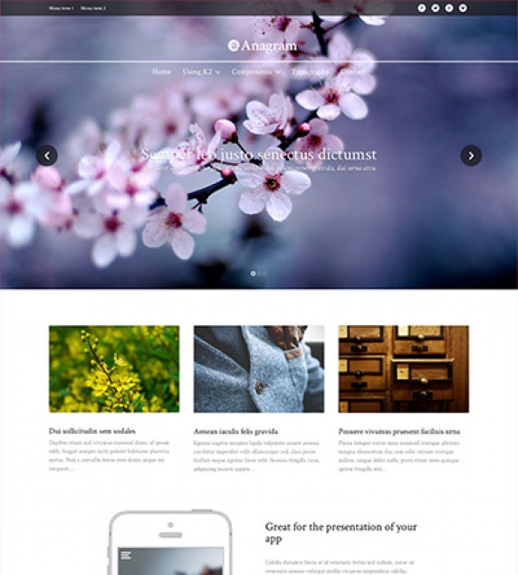
Setting up our Demo
As you can see our template in the frontpage only uses K2 modules instead of the component view. As for the component view you can choose between the blog view and the gridded view.
The Front-page and module positions
As stated above you have numerous options and module positions to choose from for your front page.
There are three module positions placed one bellow the other so you can order your content more effectively including a slideshow which covers the entire viewport in certain resolutions.
Furthermore there is a module position in the component area if you choose to use modules instead of the component.
Finally there are positions bellow the component area, a sidebar, three positions next to each other in the footer and two full width module positions.
Callouts
This template offers two full width module positions perfect for full width “call to action” modules. These positions are anagram_Top_Callout and anagram_Lower_Full. In the demo site we have published the Call action and Video background modules.
Template functionality.
From the template’s settings view apart from the colours, you can also control most of the template’s functionality.
- Choose between off canvas and normal navigation
- Use your own colour variations
- Enter your social links
- Select the main text and header font.
All these settings are located in template’s parameters.
Setting up the menus.
In the template’s parameters (template specific tab) as mentioned above you can select the look and feel of your menu.
Whether you choose the off canvas navigation or the inline menu all you need to do is to publish your menu in the anagram_Menu position.
Using a custom menu
This template offers you the ability to use one level custom menus in both the header of the site and the footer of the site.
The module positions for these menus are anagram_Secondary_Menu and anagram_Footer_Menu.
Using a social menu
The social menu (the one placed on the footer) uses its own overrides. You need to choose the appropriate layout for the module’s settings. You can do this by selecting the “social” option from the Alternate Layout select box.
Finally don’t forget to set the appropriate CSS class (Link CSS Style). The class should be the name of the network, e.g. facebook, twitter, google-plus, vimeo etc.
K2 Content and Categories setup
This template offers two different layouts, now for each image size.
a typical blog layout.
a gridded layout
To use one of these layouts you do not need to change between K2 templates, all you need to do it to choose the appropriate set of items.
Using the leading items
By using the leading items and the large image size you will get the blog layout.
Using the secondary items
By using the primary items and the medium image size you will get can set up your gridded layout
K2 Content module templates
- 2Block - Used the in testimonials module
- 3BlockGrid - Used in the top gridded module
- Banner - The banners on the frontage’s sidebar
- Callout - The “Call to Action” module
- Component - Component styled module
- SlideIn - For animated modules
- Slideshow - For K2 items
- Video - For creating stunning video backgrounds
Icon Fonts
We have included the Entypo family from fontello.com as well as the Drip Icons.
You can download the font family and view the complete glyph guide from: http://demo.amitjakhu.com/dripicons/
Animations
You can easily create your own animations using natural, declarative language:
<!-- Reveal using custom parameters -->
<div data-scroll-reveal="enter left and move 50px over 1.33s">Foo</div>
<div data-scroll-reveal="enter from the bottom after 1s">Bar</div>
<div data-scroll-reveal="wait 2.5s and then ease-in-out 100px">Baz</div>
More information can be found at https://scrollrevealjs.org/ and at https://github.com/jlmakes/scrollreveal (GitHub repo).
Module positions
- anagram_Hero
- anagram_Menu
- anagram_Secondary_Menu
- anagram_Top_1
- anagram_Top_2
- anagram_Top_Callout
- anagram_Breadcrumb
- anagram_Component
- anagram_Right
- anagram_Lower_Full
- anagram_Lower_1
- anagram_Lower_2
- anagram_Footer_1
- anagram_Footer_2
- anagram_Footer_3
- anagram_Footer_Menu
Image Sizes
The following image sizes are recommended for this template:
- * XSmall 150
- * Small 260
- * Medium 400
- * Large 900
- * XLarge 1280
- * Generic 900
- * Category Image 100
- * Avatar Size 100
- * Commenter Image 48
Module Suffixes
- * .left adds a float:left to a block.
- * .right adds a float:right to a block.
- * .text-center adds a center alignment to a block.
- * .text-right adds a right text alignment to a block.
- * .text-left adds a left text alignment to a block.
Additional Components
Apart from the K2 component we offer CSS styling for the following components
com_contact (form only)
com_users ( all views )
com_search
com_weblinks
com_newsfeeds
Commercial Extensions
Simple Image Gallery Pro - After installing it go to the Extension's parameters Layout template for image galleries and choose the one named after the template, i.e. matchbox and matchbox_module.
For developers and enthusiasts
The Grid
We are using ZURB's foundation grid for this template. You can find out more about foundation here: http://foundation.zurb.com/
Addtionally we have added a grid for larger (xl) and very large (xxl) viewports.
Block Grid - for developers and enthusiasts
We have included Foundation's block grid.
More info can be found here. http://foundation.zurb.com/docs/components/block-grid.html
Visibility Classes
If you need complete control over your modules in responsive states we 've got you covered. This template uses the power of the The most advanced responsive front-end framework in the world, ZURB's foundation.
.hide-for-small Hides the module in viewports bellow 900px
.show-for-small Shows the module in viewports bellow 900px
.hide-for-medium Hides the module in viewports above 768px and bellow 1279px
.hide-for-medium-up Hides the module in viewports above 768px
.show-for-medium Shows the module in viewports above 768px and bellow 1279px
.show-for-medium-up Shows the module in viewports above 768px
.show-for-medium-down Shows the module in viewports bellow 1279px
.show-for-large Shows the module in viewports above 1280px and bellow 1440px
.show-for-large-up Shows the module in viewports above 1280px
.hide-for-large Hides the module in viewports above 1280px and bellow 1440px
.hide-for-large-up Hides the module in viewports above 1280px
.show-for-xlarge Shows the module in viewports above 1440px
.hide-for-xlarge Hides the module in viewports above 1440px
.show-for-landscape Shows the module in the landscape orientation
.hide-for-landscape Hides the module in the landscape orientation
.show-for-portrait Shows the module in the portrait orientation
.hide-for-portrait Hides the module in the portrait orientation
All these classes are located in the template.css and can be easily expanded and/or edited and can be used for every block of your template, not just your modules.
More info can be found here: http://foundation.zurb.com/docs/components/visibility.html
k2.css
As you might have noticed this template does not use the default k2.css. We have completely rewritten all the template's styles to be more efficient. In case you download the standalone template package we have included a blank k2.css file in our distribution to avoid 'breaking' you site.
SASS Support
In your template's /css folder you will find a /src subfolder. There you will find all out .sass files.
We have also used Bourbon which is a simple and lightweight mixin library for Sass
What is SASS: http://sass-lang.com/
What is Bourbon: http://bourbon.io/
Visual Walkthrough


https://www.joomlaworks.net/blog/itemlist/date/2011/component/pds?start=70#sigProIdbf570395d3
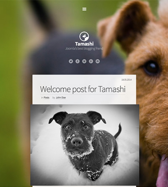
Setting up our Demo
As you can see our template only uses the component views, category, user, tag item lists and item views.
Template functionality.
From the template’s settings view apart from the colours, you can also control most of the template’s functionality.
Choose between off canvas and normal navigation
Use your own colour variations
Enter your social links
Select the main text and header font.
All these settings are located in template’s parameters.
Setting up the menus.
In the template’s parameters (template specific tab) as mentioned above you can select the look and feel of your menu.
Whether you choose the off canvas navigation or the inline menu all you need to do is to publish your menu in the tamashi_Menu position.
Using a custom menu
This template offers you the ability to use one level custom menus in both the header of the site and the footer of the site.
The module position for these menus is tamashi_Footer_1.
K2 Content and Categories setup
This template offers a simple Ghost inspired blog layout.
Due to the nature of this template higher quality/sizes images are required.
K2 Content module templates
There is a template override for the K2 Content module. You can see it in the sidebar (see the demo site for more information). To use this template in the sidebar you should use the default-listing module class.
Icon Fonts
We have included the Entypo family from fontello.com as well as the Simple Line icons.
You can download the font family and view the complete glyph guide from: http://graphicburger.com/simple-line-icons-webfont/
Animations
You can easily create your own animations using using using natural, declarative language
<!-- Reveal using custom parameters. -->
<divdata-scroll-reveal="enter left and move 50px over 1.33s"]]]]]]> Foo </div><divdata-scroll-reveal="enter from the bottom after 1s"]]]]]]> Bar </div><divdata-scroll-reveal="wait 2.5s and then ease-in-out 100px"]]]]]]> Baz </div>
More information can be found at http://scrollrevealjs.org/ and https://github.com/julianlloyd/scrollReveal.js
Module positions
- tamashi_Logo
- tamashi_Menu
- tamashi_Right
- tamashi_Top
- tamashi_Component
- tamashi_Footer_1
- tamashi_Footer_2
Image Size
The following image sizes are recommended for this template:
- XSmall 150
- Small 260
- Medium 400
- Large 900
- XLarge 1280
- Generic 900
- Category Image 100
- Avatar Size 100
- Commenter Image 48
Module Suffixes
- .left adds a float:left to a block.
- .right adds a float:right to a block.
- .text-center adds a center alignment to a block.
- .text-right adds a right text alignment to a block.
- .text-left adds a left text alignment to a block.
- .default-listing for the K2 item listings.
Additional Components
Apart from the K2 component we offer CSS styling for the following components
com_contact (form only)
com_users ( all views )
com_search
com_weblinks
com_newsfeeds
Commercial Extensions
Simple Image Gallery Pro - After installing it go to the Extension's parameters Layout template for image galleries and choose the one named after the template, i.e. matchbox and matchbox_module.
For developers and enthusiasts
The Grid
We are using ZURB's foundation grid for this template. You can find out more about foundation here: http://foundation.zurb.com/
Addtionally we have added a grid for larger (xl) and very large (xxl) viewports.
Block Grid - for developers and enthusiasts
We have included Foundation's block grid.
More info can be found here. http://foundation.zurb.com/docs/components/block-grid.html
Visibility Classes
If you need complete control over your modules in responsive states we 've got you covered. This template uses the power of the The most advanced responsive front-end framework in the world, ZURB's foundation.
.hide-for-small Hides the module in viewports bellow 900px
.show-for-small Shows the module in viewports bellow 900px
.hide-for-medium Hides the module in viewports above 768px and bellow 1279px
.hide-for-medium-up Hides the module in viewports above 768px
.show-for-medium Shows the module in viewports above 768px and bellow 1279px
.show-for-medium-up Shows the module in viewports above 768px
.show-for-medium-down Shows the module in viewports bellow 1279px
.show-for-large Shows the module in viewports above 1280px and bellow 1440px
.show-for-large-up Shows the module in viewports above 1280px
.hide-for-large Hides the module in viewports above 1280px and bellow 1440px
.hide-for-large-up Hides the module in viewports above 1280px
.show-for-xlarge Shows the module in viewports above 1440px
.hide-for-xlarge Hides the module in viewports above 1440px
.show-for-landscape Shows the module in the landscape orientation
.hide-for-landscape Hides the module in the landscape orientation
.show-for-portrait Shows the module in the portrait orientation
.hide-for-portrait Hides the module in the portrait orientation
All these classes are located in the template.css and can be easily expanded and/or edited and can be used for every block of your template, not just your modules.
More info can be found here: http://foundation.zurb.com/docs/components/visibility.html
k2.css
As you might have noticed this template does not use the default k2.css. We have completely rewritten all the template's styles to be more efficient. In case you download the standalone template package we have included a blank k2.css file in our distribution to avoid 'breaking' you site.
SASS Support
In your template's /css folder you will find a /src subfolder. There you will find all out .sass files.
We have also used Bourbon which is a simple and lightweight mixin library for Sass
What is SASS: http://sass-lang.com/
What is Bourbon: http://bourbon.io/
Visual Walkthrough


https://www.joomlaworks.net/blog/itemlist/date/2011/component/pds?start=70#sigProIde7649cec4e
There are some steps you need to follow in order to install the template package.
- Login to the backend of your site.
- Go to Extensions → Extensions Manager, click on Browse button, locate the .zip file of the template you have downloaded and click on Upload & Install button.
- After the success message go to Extensions → Template Manager, locate the template you just installed and edit it. Check all parameters and fill in where needed. For more details on that, advise each template's documentation or the Quickstart package you have downloaded.
- Once done with that, Save your changes by clicking on the Save button.
- As a last step, make this template the Default one. To achive that, choose it from the list and select the Make Default button from the menu on the top of the screen.
Note: If you are using the Quickstart package always update the template package as it may contain changes.
Before you start with the nuContent plugin setup, go to the Downloads section and download it. The Quickstart package already includes this plugin, so if you choose to use it, there is no need downloading it.
Installing nuContent Package
- After logging in the backend of your site, go to the Extensions → Extensions Manager, click on Browse button, locate the .zip file and click on Upload & Install button.
- After the success message you can start setting up. Begin with setting up the Plugin first and move on to the Modules afterwards.
Setting up nuContent Plugin
The nuContent plugin, is located in Extensions → Plug-in Manager as Content - NuContent. It has two set of options. The Basic and the Advanced.
In Basic options you can set:
- in which categories to render the plugin
- the image sizes to use in your content views. The image sizes available are: XS, S, M, L, XL, like K2. You can select which size you want to render in the listing pages and in the article pages. After putting the options needed, SAVE them and then click on the Import Joomla articles button, located under Maintenance header. It is very important to enter all options for the images and SAVE first, before clicking the import button.
In the Advanced options there are also some set of options that add extra functionality such as:
- the latest from user X articles,
- the X number of articles that are related by tag with the one you are viewing and
- the use of DISQUS as your comments mechanism.
Note *: It is advised to enter all or some of your content first and click on the Import Joomla articles button through the plugin afterwards. If something like that is not possible, use the Regenerate Images option under Maintenance in the plugin parameters.
Setting up nuContent Modules
Along with the nuContent plugin, a set of modules with pretty similar structure and functionality with K2 modules are provided. The available nuContent modules are: nuContent Comments, nuContent Items, nuContent Menu, nuContent Tools and nuContent Users.
The nuContentComments module includes the following two options: Latest Comments, Top Commenters, like the K2 Comments module. The difference is that the nuContentComments module fetches its content through DISQUS.
The nuContent Items module fetches articles of all/specific categories or specific articles. It has multiple parameters which are similar to those of the K2 Content Module and can be seen through the screenshots below.
The nuContentMenu module could be used to substitute the Menu Module of Joomla.
The nuContent Tools module includes the following options: Archive, Authors List, Blog style - Calendar, Breadcrumbs, Categories List (Menu), Category Select Box, Search Box, Tag Cloud, Custom Code. Depending on which one you choose, you need to set the appropriate parameters. The available parameters are shown to the screenshots below.
The nuContent Users module shows all or specific users/authors with their details (name, avatar, e-mail) and a number of the items they have written.
Depending on the template you are using, visit the demo site, locate the module you want to use and advise the template's documentation or Visual Walkthrough for the appropriate setup.
Note **: In order for the tag cloud option in nuContent Tools module and the tags in nuContent Items to work, you will have to edit the content plugin we described above andclick the Import !Joomla Articles button. The Meta Keywords field of each article is used for the tags and tag cloud.
Note ***: For Joomla 3.1 you can either use the Meta Keywords field and render those tags through the nuContent plugin, or you can just use the Tags field and get the default Joomla functionality of the tags.