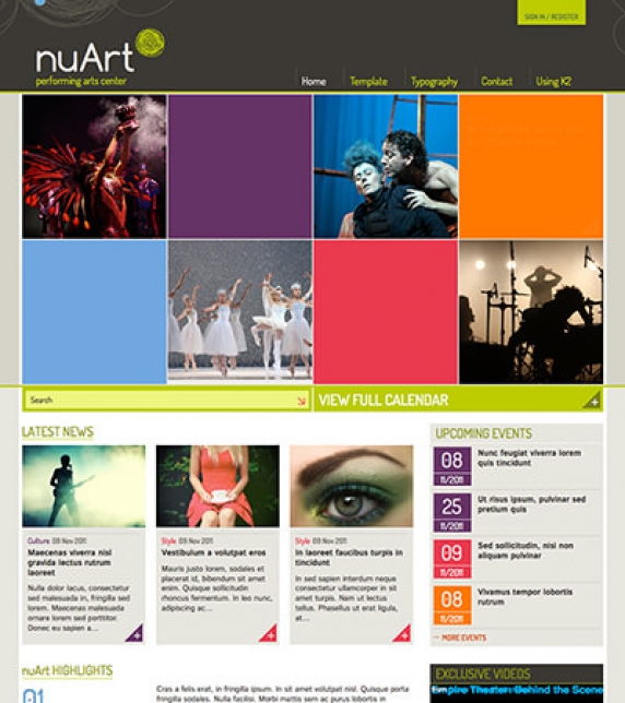
Setting up our demo
This template has one setup category called Subjects. All other categories inherit its parameters. The layout is single columned with five Primary items. There is no use of Leading or Secondary items, but can be used if needed.
The Medium sized photos are used for best result. Large images are not suitable for these layouts and Small and XSmall sizes are too small.
Image sizes
The following image sizes are recommended for this template:
- XSmall 100
- Small 210
- Medium 276
- Large 666
- XLarge 900
- Generic 276
- Category image 306
- Avatar size 100
- Commenter image 48
Module suffixes
This template uses the basic suffixes as described here. Moreover, if you want your module to have a grey background (#E7E6DF) just use the .greyBox suffix.
The .k2ItemsVideoBlock is used on the Video gallery module. If you want a Video gallery on your site or you want the look and feel of this module you have to use this class as suffix.
Template specific module overrides
The Photogrid (home page module) and the Video gallery are templates specifically for the K2 Content module.
If you choose not to use the K2 Component, the Photogrid override is also available through the nuContent plugin.
Extra Fields
On the category listing and on the K2 item page, there is some extra information like Dates and Tickets. This information is added through K2 Extra Fields. Those extra fields belong to a K2 Extra Field Group which is assigned to the preffered K2 Category. The type for the Date field is date and for the Tickets is Textarea.
Setting up the Highlights section
The Highlight section is located in the bottom left part of the frontpage on the Demo site, under the heading "nuArt HIGHLIGHTS". This section can be set up through the Template Parameters. Go to Extensions → Template Manager and after you locate the template, open it and head up to the Template Specific Tab. There you will find the Content Highlights Section and you can Add, Edit or Remove a highlight.
Setting up custom colors per category
To set up a color per category (either K2 or Joomla) go to the Template's Parameters and locate the Category Colors under the Template Specific Tab. You can choose any custom color for your category, either through the color picker or by inserting directly the hex of the color, i.e. #FFFFFF for white. If you have installed the Quickstart package the colors will be already preselected to the four ones (purple (#663366), orange (#FF7800), light blue (#70A7E0), fuchsia (#EA3A4E)) you see in the Demo site.
Commercial Extensions
Simple Image Gallery Pro - After installing it go to the Extension's parameters Layout template for image galleries and choose the one named after the template, i.e. nuArt.
Visual Walkthrough


https://www.joomlaworks.net/blog/itemlist/date/2011/component/pds?start=60#sigProId864830b482
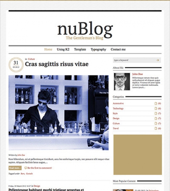
Setting up our demo
In this template, there is one setup category and all others inherit its parameters.
Use one Leading item with a Large image and five Primary items with a Medium sized image both in a single column.
Please note that both Leading and Primary items have different templates assigned to them.
As you can see on the Demo site, the Leading item/s have a different date listing and a different setup from the other items.
Image sizes
The following image sizes are recommended for this template:
- XSmall 100
- Small 125
- Medium 285
- Large 626
- XLarge 900
- Generic 285
- Category image 100
- Avatar size 100
- Commenter image 48
Module suffixes
Apart from the basic suffixes explained here, you can also use the following suffixes:
.isFontKameron if you want your element or module to be rendered with the 'Kameron' font family.
.banner for small rectangle banners (300px x 250px).
.veticalList should be used to render modules with large unordered lists like the most popular content on the frontpage.
Commercial Extensions
Simple Image Gallery Pro - After installing it go to the Extension's parameters Layout template for image galleries and choose the one named after the template, i.e. nuBlog.
Visual Walkthrough


https://www.joomlaworks.net/blog/itemlist/date/2011/component/pds?start=60#sigProId6dfe19dbb0
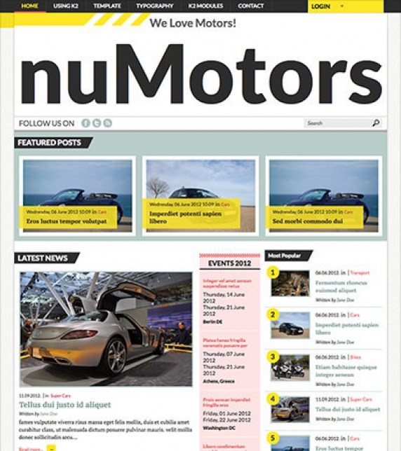
Setting up our demo
The home page of this template consists of a K2 content module instead of the regular component view.
The Medium image size is used instead of the Large images used elsewhere.
For all other pages the three items with Large images are used in a single column.
We also have a basic gridded layout. This can be achieved by using two columns for the Primary or Secondary item groups and the Small image size.
Moreover, you can also use the Links item group which is used with the Small sized images in a single column.
Image sizes
The following image sizes are recommended for this template:
- XSmall 100
- Small 190
- Medium 456
- Large 614
- XLarge 900
- Generic 300
- Category image 100
- Avatar size 100
- Commenter image 48
Module suffixes
- .k2LoginMod should be used if you want the slidding module. Both Joomla login and K2 User module are bound with this class. Do not alter it, as the jQuery script will not trigger.
- .modFeatured is used with the K2 Content module with featured posts on the Demo site.
- If you want to render a K2 Content module or a nuContent module on the frontpage instead of the component, just like the Demo site, you will have to use the .modFrontPage suffix.
- .itemLinksmod suffix replicates the links (K2) item Group. To be more specific the 'CAR REVIEWS' module on the frontpage uses this suffix.
- .modEvents renders the module with a pink background (#FEE3E3) like the 'EVENTS' on the frontpage.
- .isFontSans renders the module with Lato (sans-serif) font family, unless there are styles specified elsewhere.
Sidebar modules
- .videoGalMod is used for the Video gallery (only in K2)
- .modPopular is used with the appropriate module template to produce the numbered items.
- .banner is used on the rectangle banners on the sidebar.
- .modLists is used both for the K2 and nuContent modules in order to render listed modules like 'Listed Articles' under Joomla Modules page in the Demo site.
Template specific module overrides
K2 Content Module
- Featured items
- With only the first item image visible
- Frontpage Module
- Numbered List
- Video Gallery
nuContent Module
- Default module template
- Featured items
- With only the first item image visible
- Frontpage Module
- Popular Articles
Extra Fields
In some modules (eg. Events module on the frontpage of our Demo site) you might notice dates and places of the events.
For better content management we have set up some Extra Fields that are associated with the Events Category. Those are the event's date (start - finish) and place. The event's date consists of two Extra Fields typed as Date fields (The event's start and finish date) and the last one is a Text Field type for the place of the event.
These Extra Fields are shown only inside the item page and the events module, so be sure to use the .modEvents suffix.
As you can notice there is a different styling between the dates and place.
The pattern we use for styling extrafields is:
Inside the Extra Fields loop (foreach) of our K2 Content module we set up another parameter called $key which is the auto-increment number of each extrafield starting from zero (0).
For instance, the date fields will have the CSS classes .field0 and .field1 assigned to them while the place will have the class .field2.
This way it's easier to add more Extra Fields and style them anyway you want.
Commercial Extensions
Simple Image Gallery Pro - After installing it go to the Extension's parameters Layout template for image galleries and choose the one named after the template, i.e. nuMotors.
Visual Walkthrough


https://www.joomlaworks.net/blog/itemlist/date/2011/component/pds?start=60#sigProId17e906f96c

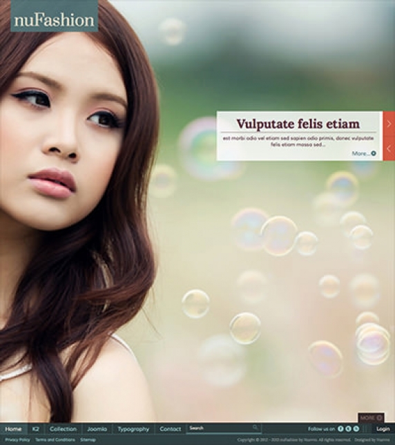
Setting up our demo
In the homepage of our demo site we have setup a Slideshow which is based on a K2 Content module *. We also provide styles for the Frontpage Slideshow extension from JoomlaWorks in case you want to use that instead *.
In this Demo site two different setup categories are used. Due to the nature of the content (movie posters) there is a different template for Movie listings and a different one for News listings.
For the News listing two different groups of items are used, the Leading and the Primary group. Alternatively, you can set only one group, since the same image size is used for both. The default K2 template is what you need for these listings with the Large image size for the category listings in a single column. The number of items is set to one Leading, three Primary for the Homepage and three Leading, three Primary for the listings.
The Movie listing uses a different K2 template, the movieListings. The main difference between this type of list and the one for News is that due to the movie posters format the Medium image size is used instead. The setup for this list is: three Leading items and three Primary items in a single column.
Image sizes
The following image sizes are recommended for this template:
- XSmall 100
- Small 200
- Medium 478
- Large 648
- XLarge 900
- Generic 300
- Category image 100
- Avatar size 100
- Commenter image 48
Module suffixes
- .sideVideoGallery to be used with the Video Gallery module.
- .banner300 to be used with rectangle banners.
- .mostCommented produces the most commented lists.
- .movieReviews is used on the K2 Content module 'Movie Reviews' located in the right sidebar on the Demo site.
- .listModule suffix is used to style modules such as K2 Content with large unorderded (<ul>) lists of data.
- .condensed class renders the entire module with the 'Open Sans Condensed' font.
- .blockmod is used with gridded style content modules. In the Demo site the 'Editor’s Picks' module uses the .blockmod suffix.
- .slidingModule should be used for the K2 Content module with the nuSlider template.
- .whiteBg renders the module with a white background (#FFFFFF), a 3px radius and a light CSS3 box shadow.
Template specific module and component overrides
K2 component
There are two template overrides. One for the default item listings and one with a smaller image for the movie listings. The latter is very useful if you have large portait images, (eg. movie posters) and you do not want your article area to be too tall.
K2 Content Module
- Agenda Module
- Most Commented items Module
- Editor’s Pick Module
- Default and Default list module
- Opinion module
- Quotes module
- Movie Slider Module
- nuSlider Module (upcoming Events)
- Video Gallery module (sidebar)
K2 Users Module
Default and the “Articles by Users” module
nuContent Module
- Agenda Module
- Editor’s Pick Module
- Default and Default list module
- Opionion module
- Quotes module
- nuSlider Module (upcoming Events)
Extra Fields
In some modules (eg. the 'DON'T MISS' module on the frontpage of our Demo site) there is some extra information, such as the date (as title) and place (at the bottom of each item in black bold letters) of an event.
This extra information uses a K2 feature called Extra Fields. For better content management we have set up one Extra Field Group containing these two Extra Fields (both of them are Text Fields) and we have associated it with the Events category.
These Extra Fields are shown only inside the item page and the Events ('DON'T MISS') module. The styling is a little different in each case.
The pattern we use for styling Extra Fields is:
Inside the Extra Fields loop (foreach) of our K2 Content module we set up another parameter called $key which is the auto-increment number of each Extra Field starting from zero (0). For instance, the Text Field that has an output of the event’s date and duration will have the CSS classes .field0 assigned to it while the place will have the class .field1. This way it's easier to add more Extra Fields and style them anyway you want.
Extra Fields are also used for the 'Quotes'. The Author (by) and the Movie (in) are Text Fields belonging to the Quotes Extra Field Grοup assigned to the Quotes category.
Finally, all movie details such as the 'Director', the 'Cast', the 'Genre' and 'when it is anticipated to appear in cinemas' are Text Fields belonging to the Movie Info Extra Field Grοup assigned to relative categories.
Setting up the tabs
On the frontpage there are four tabbed modules. These are four different module positions called nuMovies_tab1 - 4.
After assigning the modules to those positions you will notice that the tab headers have not been changed. Due to the limited space and wanting to preserve a somehow logical module naming, the tab headers are NOT the module titles.
To name the tabs go to Extensions → Template Manager, locate your template, open it, and through the Template Specific Tab you will find the Tabs. Name them through the appropriate fields.
Commercial Extensions
Simple Image Gallery Pro - After installing it go to the Extension's parameters Layout template for image galleries and choose the one named after the template, i.e. nuMovies.
Frontpage SlideShow - After installing it go to the Component to setup your Slides category, add your slides (advise the Visual Walkthrough on how to set them up) and through the module's parameters (Extensions → Module Manager) select the NuMovies template.
Note *: The Slideshow template is also available through nuContent Items module in case you don't want to use the K2 component on your site.
- If you chose to use the Quickstart package, you can locate the K2 Content module in the position nuMovies_slideshow, through Extensions → Module Manager and check how it is setup.
- If you chose not to use the Quickstart package, you need to follow the steps below in order to setup the K2 Content module (similar for nuContent Items module) to be used as a Slideshow:
- Go to Extensions → Module Manager,
- Create a K2 Content module by clicking on the New button from the top toolbar,
- Select the Slideshow as the module's template,
- Either get items through a category you have created for this purpose or just select specific items,
- Select to show the Title, XLarge image, Category and Created date and time,
- Publish it in nuMovies_slideshow position.
Visual Walkthrough


https://www.joomlaworks.net/blog/itemlist/date/2011/component/pds?start=60#sigProId0baab42838
Setting up our demo
This template offers three different views. The Home page, which consists of modules and not the component, the blog style layout and the catalog layout.
As the main Slideshow of the Home page we use a K2 Content module instead of the component. In order NOT to load the component just set your Home menu item as a K2 Categories with 0 items from multiple categories. Alternatively, you can use the K2 component as a 'Featured Articles' type with no (0) articles. *
For the Catalog view we use the K2 component override template named catalog. In order to achieve the exact look as the Demo site, we have set a four columned layout with twelve (12) Primary items. The best image size for this is the Small size. The Sub-category view options should be set up next. It is recommended to keep the same four columned layout with your Sub-categories as well.
Please note that it is important to set the Catalog mode to Yes, this is located on the Layout Grid panel just under the links section.
The Blog layout is much simpler. We use three Leading items with Large images on a single columned layout.
Image sizes
The following image sizes are recommended for this template:
- XSmall 124
- Small 234
- Medium 482
- Large 610
- XLarge 900
- Generic 610
- Category image 234
- Avatar size 100
- Commenter image 48
Module suffixes
- .greenPattern produces a nice green patterned (#53777A) background, used only for sidebar modules.
- .purpleBlock gives you a nice purple (#542437) background.
Footer module suffixes
In the Demo site we use the .first, .second, and .third module suffixes for the modules appearing in the More block, after clicking on the 'More' button at the bottom of the site above the menu.
These classes gives them the appropriate widths and structure. Remember to use these classes or in case you might need a different layout to define your own classes.
Template specific module and component overrides
K2 component
We have two K2 component overrides, one for the Catalog view and one for the Blog listing (default template) as described above.
K2 Content Module
- Catalog (Featured Products)
- Default (Latest from the blog, Latest Posts, Most Popular)
- Slideshow (for the Homepage Slideshow, as an alternative)
Extra Fields
The Extra Fields defined in this Demo site are used for the Catalog view. Those are 'Model', 'Composition', 'Available Sizes', 'Colors', 'Designer' and 'Price'. In order to use these specific Extra Fields select the catalog template for your K2 Category and make sure to preserve their names.
These Extra Fields have a specific styling and their names are used to bind them with specific classes. The 'Available Sizes' and the 'Colors' Extra Fields are a multiselect list. For the correct color to appear next to the name of the color, you should add some CSS in the custom.css file. Depending on the color name you have applied in the multiselect list, a class is added for each color name. We have predefined three colors, White, Pink and Light Blue. For example, for the color White, the CSS added is:
div.itemExtraFields ul li span.itemExtraFieldsValue span.White {
background: #FFFFFF; border:1px solid #C6B299; margin: 0 5px 0 0;
}
Any other Extra Field will appear on the site with the default styling and after the aforementioned fields. For more details of how the item page is structured with those Extra Fields, please advise the Visual Walkthrough.
Commercial Extensions
Simple Image Gallery Pro - After installing it go to the Extension's parameters Layout template for image galleries and choose the one named after the template, i.e. nuFashion.
Frontpage Slideshow - After installing it go to the Component to setup your Slides category, add your slides (advise the Visual Walkthrough on how to set them up) and through the module's parameters (Extensions → Module Manager) select the nufashion template.
If you follow the instructions and set the Home menu not to include any components, publish the slideshow on the nuFashion_Slideshow position.
The slideshow template and the template itself is responsive so keep in mind that different people with different viewports will access the site. In order to provide the best experience you should keep a standard ratio of your images and remember the images will always scale proportionally so you have to keep the main subject of the image on the middle.
Expert Tip!
The main menu position and the login module positions are located on the bottom of the homepage and on the top of every other page. These modules are exactly the same, you don't have to set up and publish duplicate modules.
The Slideshow has an absolute position and a width and height of 100%. This means you can easily create a nice scrolling slideshow over your content. You just have to set the appropriate padding on your content section (section.content), just make sure to use the .isFrontpage body class. The CSS statement should look like this .isFrontpage section.content
Note *: The Slideshow template is also available through nuContent Items module in case you don't want to use the K2 component on your site.
- If you chose to use the Quickstart package, you can locate the K2 Content module in the position nuMovies_slideshow, through Extensions → Module Manager.
- If you chose not to use the Quickstart package, you need to follow the steps below in order to setup the K2 Content module (similar for nuContent Items module) to be used as a Slideshow:
- Go to Extensions → Module Manager,
- Create a K2 Content module by clicking on the New button from the top toolbar,
- Select the Slideshow as the module's template,
- Either get items through a category you have created for this purpose or just select specific items,
- Select to show the Title, Introtext with a 10 word limit, XLarge image, Category and Read More link,
- Publish it in nuFashion_Slideshow position.
Visual Walkthrough


https://www.joomlaworks.net/blog/itemlist/date/2011/component/pds?start=60#sigProId7c8d13de64
Setting up our demo
This template has two different layouts for listings.
One for the frontpage and one for the category/categories.
For the frontpage grid layout we need four Primary items with Medium image size in a single column. The grid layout of the frontpage inherits its parameters from the menu item.
For the category listings we use:
- two Leading items with Medium image size in two columns,
- four Primary items with Small image size in a single column.
Image Sizes
The following image sizes are recommended for this template:
- XSmall 100
- Small 240
- Medium 400
- Large 778
- XLarge 1200
- Generic 300
- Category Image 100
- Avatar Size 100
- Commenter Image 108
Module Suffixes
- .floatLeft, .fLeft adds a float:left to a block.
- .floatRight, .fRight adds a float:right to a block.
- .center, .text-center adds a center alignment to a block.
- .redModule adds a red (#e03720) background color on any sidebar module, like Agenda and Most Commented modules.
- .noise adds a transparent noise to the background. It is not intrusive to the background color and can be used with a variety of combinations.
- .white, .whiteBg adds a white (#ffffff) background color on any sidebar module.
- .whiteModuleShadow adds a white background color along with a shadow, like all sidebar modules under K2 Modules section on the Demo site.
- .shadowed adds a shadow without any background color.
Template Specific Module overrides
K2 Content Modules
- Agenda
- Default
- DontMiss
- Grid - Editors choice
- LatestInterviews
- LatestVideos
- MostCommented
- Opinion
- Quote
- Scroller - Scroller module 1 - 2 (Latest Releashes, Upcoming tabs)
- Slideshow
NuContent Modules
- Agenda
- Default
- DontMiss
- Grid - Editors choice
- LatestInterviews
- MostCommented
- Opinion
- Quote
- Scroller
- Slideshow
Extra fields
For better content management we have set up some Extra Fields that are associated with specific categories.
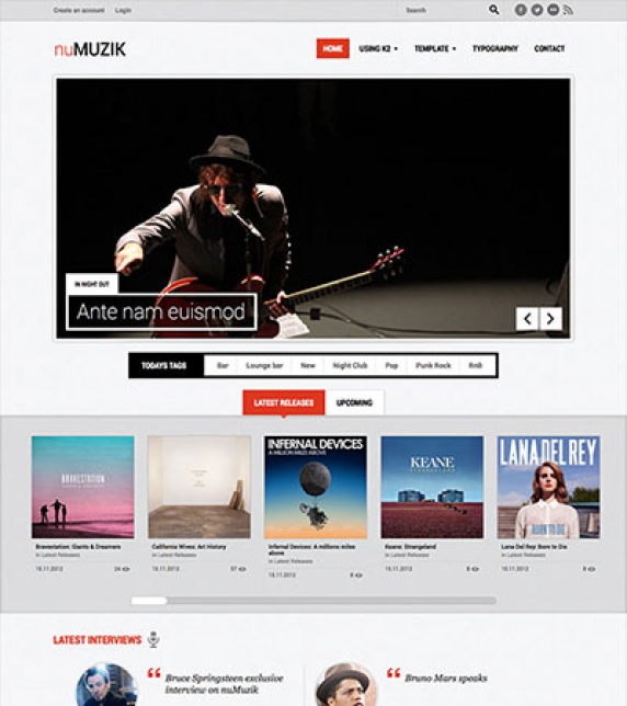
Let's start with the Quotes category. The Quotes category is associated with the Quotes K2 Content Module which is located in the Homepage of the Demo site, at the bottom, next to the About us block.
For this category we have set up an Extra Field Group called Quotes which includes one Extra Field, Text Field, the Quoter. The Quoter name you see on the module, is this Extra Field.
Another category that uses Extra Fields is the Interviews category. This category is associated with the Latest Interviews K2 Content Module which is located in the Homepage of the Demo site, right under the scrolling tabs and above the component list. For this category we have set up an Extra Field Group called Interview details which includes two Extra Fields. One is the Interviewee Name and the other is Band/Organ. Both are Text Fields and are shown under the photo of the artist, i.e. James Hetfield (Interviewee Name), Metallica (Band/Organ). In the item page they are located under the header Additional Info.
We have also created another Extra Field Group named Album Review Details. This group is assigned to the Reviews & the Latest Releases categories and it includes the following fields:
- Album Date
- Rating
- Album Name
- Band Name
Color variations
This template comes along with five preset color variations, blue, black, green, purple, and red (default color) and a custom.
To choose the one that suits you best, navigate to Extensions → Template Manager, choose the nuMuzik template and under the Template Specific tab you will find the Color Variations section where you can either choose one of the preset colors or create your own theme by assigning colors to the color pickers (Custom Color 1-4) (or just enter the hex of the color, i.e. #FFFFFF).
The colorpickers can be used in two distinct ways:
You can either select a preset color variation like blue and modify the base color or select the custom color profile and set the base color. If you choose the first option you will keep the blue iconset and complementary colors, whereas if you choose the second option, the default iconset will be used.
Example: If you want a darker blue or red for your main color you have to pick first the according color variation and then select your desired color from the colorpicker. If, on the other hand, you want a completely different color (eg. yellow) you should select the custom option and then set a color from the colorpicker. This will output a yellow color as the site's main color, a neutral complimentary color and the default iconset (red).
Note: The iconset used is supported for the preset colors only.
Setting up the tabs
On the frontpage there are two sections that use tabs. The upper one is the one that includes the Scroller modules and the lower one is the one that includes the Latest Videos modules. The upper section uses the positions nuMuzik_Upper_Tabs1 and nuMuzik_Upper_Tabs2 and the lower section uses the positions nuMuzik_Lower_Tabs1 and nuMuzik_Lower_Tabs2.
After assigning the modules to those positions you will notice that the tab headers have not been changed. Due to the limited space and wanting to preserve a somehow logical module naming, the tab headers are NOT the module titles.
To name the tabs go to Extensions → Tempate Manager, locate your template, open it, and name the tabs through the appropriate fields under the Template Specific tab.
Newsletter module
This template uses the TinyLetter Subscribe by JoomlaWorks extension as a newsletter mechanism. All you have to do is open a free account to TinyLetter and add the username in the module parameters.
Commercial Extensions
Simple Image Gallery Pro - After installing it go to the Extension's parameters Layout template for image galleries and choose the one named after the template, i.e. nuMuzik.
Visual Walkthough


https://www.joomlaworks.net/blog/itemlist/date/2011/component/pds?start=60#sigProId2d52fc4859
This template comes with three different content variations. The Construction (yellow) which is the default, the Medical (light blue) and the Technology (blue). You can choose the one you like to use through the option Content Variations under the Template Specific tab in the Template's parameters.
Setting up our demo
This template has three different layouts for listings and three different layouts for item pages.
The first category layout in use is the Default. It is used for the categories Skyscrappers, Sports Facilities, etc. For this list layout we need four Secondary items with Small image size photos in a single Column.
The next category layout in use is based on the Default layout, but has different settings in order to show as a Grid. This layout is used for the Bridges section under K2 Categories. For this layout we need six Primary items with Medium image size photos in three Columns. Another parameter that is very essential and cannot be ignored, is to give the pageSuffix gridView to the menu item pointing to that Grid category.
The last category layout is that of the Blog section. For this list layout we need two Leading items with Large image size photos in a single Column.
What we also used in this template is a different item layout for the Default K2 template. While the default item page consists of an image slideshow at the top and the item image on the left of the introtext (as shown on the K2 Item page of the demo site) OR no image slideshow on top and the item image in that position instead (as shown in a blog's item page of the demo site), this item's layout shows all images on the left and all other content on the right of the page (as shown in K2 Item -> Images on the left item of the demo site).
Image Sizes
The following image sizes are recommended for this template:
- XSmall 100
- Small 273
- Medium 353
- Large 725
- XLarge 1096
- Generic 353
- Category Image 100
- Avatar Size 100
- Commenter Image 122
Module Suffixes
- .floatLeft, .fLeft adds a float:left to a block.
- .floatRight, .fRight adds a float:right to a block.
- .center, .text-center adds a center alignment to a block.
- .left, .textLeft adds a left alignment to a block.
- .right, .textRight adds a right alignment to a block.
- .radialGradient adds a radial Gradient to any background, like the one used in the menu bar on the Construction and Medical themes or thee one used in the header's inner pages.
- .sidebarModules adds a shadow and a border right under the module title.
- .sidebarBoxes is used along with the color suffixes below and shows the module as a box also with the shadow and border right under the module title.
- .darkGrey adds a dark grey background (#3c3c3c) for both Construction and Medical themes and a black background with 0.5 opacity for the Technology theme.
- .lightGrey adds a light grey background (#f1f2f2).
- .white adds a white background (#ffffff).
- .shadow adds a shadow image at the bottom. It is used only on the Technology theme.
Template Specific Module overrides
K2 Content Modules
- 3Column
- 3ColumnFeatured
- 3ColumnWithIconOnTheLeft
- ImageSlider
- LatestBlogEntries
- LatestItems
- Quotes
- Slideshow
NuContent Modules
- 3Column
- 3ColumnFeatured
- 3ColumnWithIconOnTheLeft
- ImageSlider
- LatestBlogEntries
- LatestItems
- Quotes
- Slideshow
Extra fields
For better content management we have set up some Extra Fields that are associated with specific categories.
Let's start with the Quotes category. The Quotes category is associated with the Quotes K2 Content Module which is located in the Homepage of the Demo site, as well as in the inner pages, titled "Words from our clients".
For this category we have set up an Extra Field Group called Quotes which includes two Extra Fields, the Quoter and the Quoter Details.
Another set of Extra Fields that is used for the Projects section is the Project Details Group. This group includes the following fields: Year, Client, Visit the site, 4 image fields for the item Slideshow (Slideshow Image 1-4).
All Extra Fields in this group are shown also in the category listings and modules, if enabled, except the image types. To set up the item Slideshow just go to the Extra Fields tab in the item's page and fill in the 4 image fields with images selected from the image folder (in the demo site the folders are images/projectSlideshow/project01, images/projectSlideshow/project02, etc.). The preferable width for the images is 1096px.
If you need to use the item layout that uses the images on the left of the content, you will have to apply this Extra Field group to this category, also, and fill in the 4 image fields accordingly.
Notes: It is important to fill in the image fields from 1 to 4 and leave no blank fields in the middle, i.e. don't start with image No 2 and continue with No 4. Make sure you keep a correct order for these fields. If you need to use less images just leave blank the last fields. If you leave blank all image fields, the item image will show in the slideshow's position instead.
The Slideshow in the Homepage also uses Extra Fields. The Extra Field Group applied to this category is the Slideshow. It contains two Fields, the Title and the Tagline. The image used is the item image.
Use of page Heading
In the demo site, in all inner pages on the header, on the right there is a title. This title is the page heading and is located in the menu item under 'Page Display Options'.
Joomla Content Component
All K2 category layouts can also be applied to the Joomla Content Component. To set up the layouts for the Category Blog - List and the Category Blog, the Leading items are used in a single column. The Category Blog however, needs the page suffix catArticleViewIsBlog. The Category Blog - Grid uses six intro items in a three column grid. This layout, like the K2 Grid layout, also needs the page suffix gridView.
Newsletter module
This template uses the TinyLetter Subscribe by JoomlaWorks extension as a newsletter mechanism. All you have to do is open a free account to TinyLetter and add the username in the module parameters.
Commercial Extensions
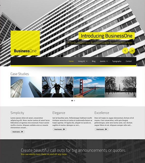
Simple Image Gallery Pro - After installing it go to the Extension's parameters Layout template for image galleries and choose the one named after the template, i.e. BusinessOne


https://www.joomlaworks.net/blog/itemlist/date/2011/component/pds?start=60#sigProId929c753f22
Setting up our Demo
This template offers multiple layouts for item listings as you can see in the demo site.
It also offers three different K2 templates, one used for the front page , one for the inner pages and a variation of the index page (best used in a three columned layout).
The Front-page
If you have already downloaded and installed the quick-start package you will notice all the settings are inherited from the K2 categories.
For the Frontpage we are using a three columned layout. We have published modules both on the newsworthy_left and right positions. We are using the frontpage template with 3 large imaged items. Alternatively you can use a K2 content module (also called frontpage).
Please note: The front page settings are located in the menu item.
Front Page Module/ Component
For the frontpage (available only if you use K2) you can also have a K2 Content module instead of the component view. Simply select the frontpage module template.
Hint. If you want to show its title like the component heading you have to use the .frontPageModule module suffix.
K2 Categories
For the item listing we are using the same setup category with the same settings but with the default template instead.
Category Images
In this template we chose to go with something different. The category image is used as a background to our page
headings. Using CSS3 awesome properties you can use a single image (a large one preferably above 1000px) and
create a beautiful cover for your headings. If you wish to support IE8 you have to use images as large as the content (1200px for IE8).
Page Headings
The big solid coloured blocks you will see in the demo site containing the title is simply the page heading and/or the K2 category title. You can enable or disable the page headings in the appropriate menu items.
Color Variations
This template comes with nine (4) preset colour variations apart from the default one.
- Black/White
- Gray/Teal
- Orange/Plum
- Yellow/Gray
You can easily change the Color Variation from the template parameters.
Image Sizes
The following image sizes are recommended for this template:
- XSmall 100
- Small 200
- Medium 400
- Large 660
- XLarge 1200
- Generic 300
- Category Image 1200
- Avatar Size 120
- Commenter Image 120
Module Suffixes
- .floatLeft adds a float:left to a block.
- .floatRight adds a float:right to a block.
- .textCenter adds a center alignment to a block.
- .textRight adds a right text alignment to a block.
- .textLeft adds a left text alignment to a block.
Template Specific Module Overrides
In this template we are using overrides for all K2 modules and several for the K2 Content module.
The following templates are available for the K2 content module
- Agenda,
- DontMiss
- Frontpage
- Interview
- Lists (generic styling)
- Popular
- Slider
- Slideshow
- VideoPlayer
- WhiteTipSingleBlock
Please Note: Apart from the VideoPlayer all the module templates are available also for the nuContent extension, for those who choose to use Joomla's default article system.
Module Classes
You can use a lot of preset module suffixes to control your layout.
- .offsetTop - provides a 30px top margin
- .offsetBottom - provides a 30px bottom margin
- .whiteBg - wraps the content in a white background
- .banner300 used for small rectangle banners
Module Positions
- newsworth_Leaderboard
- newsworth_Search
- newsworth_Slideshow
- newsworth_Menu
- newsworth_Breadcrumbs
- newsworth_aboveComponent
- newsworth_Component
- newsworth_Inside_K2_Item
- newsworth_Right
- newsworth_Left
- newsworth_underComponent-1
- newsworth_underComponent-2
- newsworth_underComponent-Half-1
- newsworth_underComponent-Half-2
- newsworth_aboveFooter
- newsworth_Footer
- newsworth_Footer-2
- newsworth_Footer-3
- newsworth_Footer-4
Module Grid
For best results and for maximum control over your responsive layout we have developed a small grid for your sidebar's (mostly) modules.
For the viewports between 900 and 569 pixels you can use the medium-module-1 to medium-module-12 (medium-module-6 for 50% width) as a module suffix.
Breadcrumbs
You have to use the following pageSuffix hasPageHeading for your breadcrumbs module if you also have a Page Title visible.
The Grid - for developers and enthusiasts
In this template we are using Foundation's 12 column grid with a small variation. You have the default large-xx , small-xx classes but we have also included a medium state (medium-xx) for viewports between 1060 and 900pixels.
More info can be found here. http://foundation.zurb.com/docs/components/grid.html
Block Grid - for developers and enthusiasts
We have included Foundation's block grid with some minor alterations and tweeks for modules like the category listings.
More info can be found here. http://foundation.zurb.com/docs/components/block-grid.html
Visibility Classes - for developers and enthusiasts
If you need complete control over your modules in responsive states we 've got you covered. This template uses the power of the The most advanced responsive
front-end framework in the world, ZURB's Foundation.
- .hide-for-small Hides the module in viewports bellow 767px
- .show-for-small Shows the module in viewports bellow 767px
- .hide-for-medium Hides the module in viewports above 768px and bellow 1279px
- .hide-for-medium-up Hides the module in viewports above 768px
- .show-for-medium Shows the module in viewports above 768px and bellow 1279px
- .show-for-medium-up Shows the module in viewports above 768px
- .show-for-medium-down Shows the module in viewports bellow 1279px
- .show-for-large Shows the module in viewports above 1280px and bellow 1440px
- .show-for-large-up Shows the module in viewports above 1280px
- .hide-for-large Hides the module in viewports above 1280px and bellow 1440px
- .hide-for-large-up Hides the module in viewports above 1280px
- .show-for-xlarge Shows the module in viewports above 1440px
- .hide-for-xlarge Hides the module in viewports above 1440px
- .show-for-landscape Shows the module in the landscape orientation
- .hide-for-landscape Hides the module in the landscape orientation
- .show-for-portrait Shows the module in the portrait orientation
- .hide-for-portrait Hides the module in the portrait orientation
- All these classes are located in the template.css and can be easily expanded and/or edited and can be used for every block of your template, not just your modules.
K2.css - for developers and enthusiasts
As you might have noticed this template does not use the default k2.css. We have completely rewritten all the template's styles to be more efficient. In case you download the standalone template package we have included a blank k2.css file in our distribution to avoid 'breaking' you site.
Additional Components
Apart from the K2 component we offer CSS styling for the following components
- com_contact
- com_content
- com_users
- com_search
- com_weblinks
- com_newsfeeds
Commercial Extensions
Simple Image Gallery Pro - After installing it go to the Extension's parameters Layout template for image galleries and choose the one named after the template, i.e. newsworth.
Visual Walkthrough


https://www.joomlaworks.net/blog/itemlist/date/2011/component/pds?start=60#sigProIdd96301ee0e
This template comes with two different content variations. The Hotel (dark grey/golden) which is the default and the Restaurant (white/orange). You can choose the one you like to use through the option Content Variations under the Template Specific tab in the Template's parameters.
The Front-page
The frontpage consists of a fullscreen slideshow (K2 Content module - Slideshow) along with four modules at the bottom. Check through the Visual Walkthrough the setup for each of these modules.
Categories
This template has two different layouts for listings along with one showing only the subcategories blocks (Accommodation/Our Menu). For all category layouts, listings and item pages we use the Default K2 template with different setup.
The first category layout in use is the one in the Blog styled categories, such as K2 Category (Blog). For this list layout we need four Leading items with Large image size photos in a single Column.
The next category layout in use is the Grid layout. This layout is used for the Accommodation/Our Menu subcategories section. For this layout we need nine Primary items with Medium image size photos in three Columns. Another parameter that is very essential and cannot be ignored, is to give the pageSuffix gridView to the menu item pointing to that Grid category.
Image Sizes
The following image sizes are recommended for this template:
- XSmall 100
- Small 200
- Medium 400
- Large 600
- XLarge 900
- Generic 600
- Category Image 300
- Avatar Size 140
- Commenter Image 80
Module Suffixes
- .floatLeft, .left adds a float:left to a block.
- .floatRight, .right adds a float:right to a block.
- .text-center adds a center alignment to a block.
- .text-left adds a left alignment to a block.
- .text-right adds a right alignment to a block.
- .alpha removes the left padding of the block.
- .omega removes the right padding of the block.
- .noPadding removes the right and left paddings of the block.
- .transition adds an ease-in transition to the element applied to.
- .whiteBg adds a white background (#ffffff) along with a 30px padding.
- .boxedBlack adds a black (#000000) transparent background with an 70% opacity.
- .borderedBox adds a 3px border to the block.
Template Specific Module overrides
K2 Content Modules
- ColumnBlocks
- FeaturedSlider
- LatestItems
- Quotes
- Slider
- Slideshow
Please Note: All the module templates are available also for the nuContent extension, for those who choose to use Joomla's default article system.
Extra fields
For better content management we have set up some Extra Fields that are associated with specific categories.
Let's start with the Quotes category. The Quotes category is associated with the Quotes K2 Content Module which is located in the bottom of almost all pages appearing as a block-quote.
For this category we have set up an Extra Field Group called Quotes which includes the textfield, Quoter Name.
Another set of Extra Fields that is used for the Hotel section is the Hotel Fields Group. This group includes the following fields: Book Now, Amenities, Rates (Period A-D), 5 image fields for the item Slideshow (Slideshow Image 1-5).
The Book Now is a Link type field. The Amenities is a Textarea type field and the Rates are Textfields appearing as a table in the item's page.
To set up the item Slideshow just go to the Extra Fields tab in the item's page and fill in the 5 image fields with images selected from the image folder (in the demo site the folders are images/itemSlideshow/doubleBed/image1, images/itemSlideshow/doubleBed/image2, etc.).
If you need to use the item layout that uses the images on the left of the content, you will have to apply this Extra Field group to this category, also, and fill in the 5 image fields accordingly.
Notes: It is important to fill in the image fields from 1 to 5 and leave no blank fields in the middle, i.e. don't start with image No 2 and continue with No 4. Make sure you keep a correct order for these fields. If you need to use less images just leave blank the last fields. If you leave blank all image fields, the item image will show in the slideshow's position instead.
For the Restaurant section the Restaurant Fields Group is used instead. This group contains a price textfield and 5 image fields for the item Slideshow (Slideshow Image 1-5) as well.
The price field appears in the category listings (grid or blog), in the item page right next to the title and in the Latest Arrivals module (Featured Slider).
Use of page Heading and Header Image
In the demo site, in all inner pages on the header, there is a title along with a background image. This title is the page heading and is located in the menu item under 'Page Display Options'. You don't have to Enable it, just fill in the text.
To setup the image, select the Link type options and from the Link Image field select the image you have pre-uploaded or upload through the media manager that opens. A preferable image size is 1200x800 pixels. When no image is set and a page heading is the page heading block appears with a solid color.
Joomla Content Component
All K2 category layouts can also be applied to the Joomla Content Component. To set up the layouts for the Category Blog, the Leading items are used in a single column. The Category Blog - Grid uses nine intro items in a three column grid. This layout, like the K2 Grid layout, also needs the page suffix gridView.
For the subcategories view we have setup the List All Categories menu type.
The Grid - for developers and enthusiasts
In this template we are using Foundation's 12 column grid with a small variation. You have the default large-xx , small-xx classes but we have also included a medium state (medium-xx) for viewports between 1024 and 600pixels and a very-small-xx for viewports below 400pixels.
More info can be found here. http://foundation.zurb.com/docs/components/grid.html
Block Grid - for developers and enthusiasts
We have included Foundation's block grid with some minor alterations and tweeks for modules like the Featured Slider located in Accommodation (Selections) or Our Menu (Latest Arrivals) page.
More info can be found here. http://foundation.zurb.com/docs/components/block-grid.html
Visibility Classes - for developers and enthusiasts
If you need complete control over your modules in responsive states we 've got you covered. This template uses the power of the The most advanced responsive front-end framework in the world, ZURB's Foundation.
- .hide-for-small Hides the module in viewports below 767px
- .show-for-small Shows the module in viewports below 767px
- .hide-for-medium Hides the module in viewports above 768px and bellow 1279px
- .hide-for-medium-up Hides the module in viewports above 768px
- .show-for-medium Shows the module in viewports above 768px and bellow 1279px
- .show-for-medium-up Shows the module in viewports above 768px
- .show-for-medium-down Shows the module in viewports below 1279px
- .show-for-large Shows the module in viewports above 1280px and below 1440px
- .show-for-large-up Shows the module in viewports above 1280px
- .hide-for-large Hides the module in viewports above 1280px and below 1440px
- .hide-for-large-up Hides the module in viewports above 1280px
- .show-for-xlarge Shows the module in viewports above 1440px
- .hide-for-xlarge Hides the module in viewports above 1440px
- .show-for-landscape Shows the module in the landscape orientation
- .hide-for-landscape Hides the module in the landscape orientation
- .show-for-portrait Shows the module in the portrait orientation
- .hide-for-portrait Hides the module in the portrait orientation
All these classes are located in the template.css and can be easily expanded and/or edited and can be used for every block of your template.
K2.css - for developers and enthusiasts
As you might have noticed this template does not use the default k2.css. We have completely rewritten all the template's styles to be more efficient. In case you download the standalone template package we have included a blank k2.css file in our distribution to avoid 'breaking' you site.
Additional Components
Apart from the K2 component we offer CSS styling for the following components
- com_contact
- com_content
- com_users
- com_search
- com_weblinks
- com_newsfeeds
- com_tags (if you are using Joomla 3.x)
Newsletter module
This template uses the TinyLetter Subscribe by JoomlaWorks extension as a newsletter mechanism. All you have to do is open a free account to TinyLetter and add the username in the module parameters.
Commercial Extensions
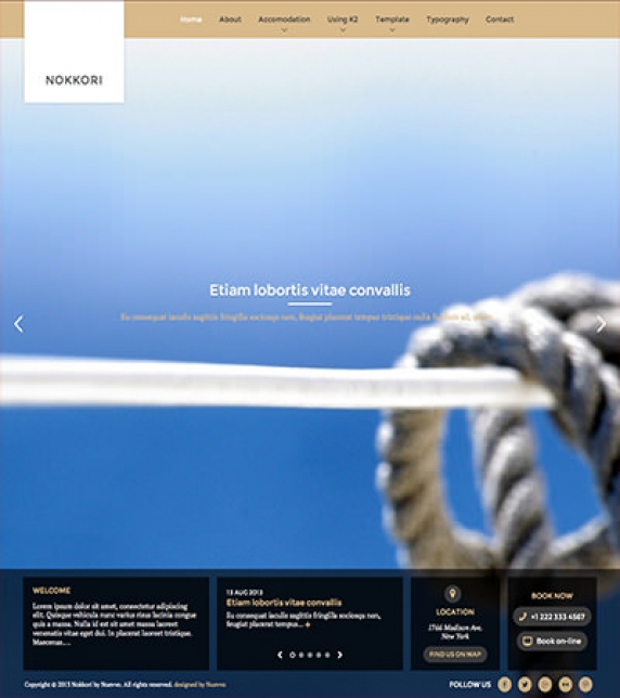
Simple Image Gallery Pro - After installing it go to the Extension's parameters Layout template for image galleries and choose the one named after the template, i.e. Nokkori.

-

-
-
-
-
-
-
-
-
-
-
-
-
-
-
-
-
-
-
-
-
-
-
-
-
-
View the embedded image gallery online at:
https://www.joomlaworks.net/blog/itemlist/date/2011/component/pds?start=60#sigProId981227380e


https://www.joomlaworks.net/blog/itemlist/date/2011/component/pds?start=60#sigProId981227380e
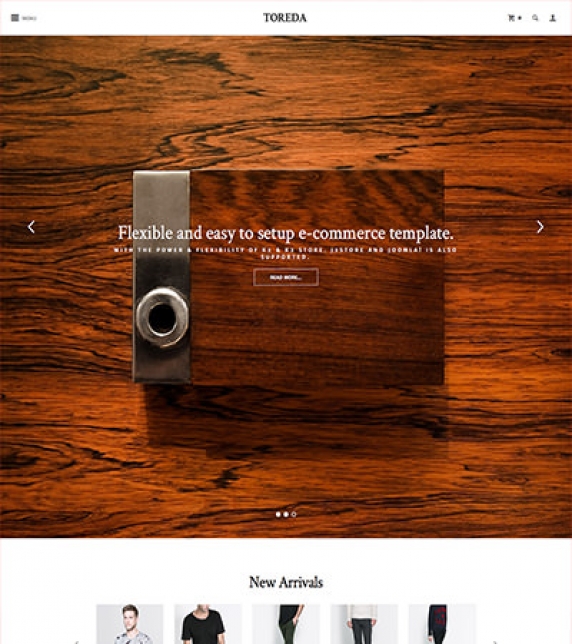
Setting up our demo
As you can see our template in the frontpage only uses K2 modules instead of the component view. This template offers multiple layouts to choose from. You can choose between a responsive slideshow or a pinterest style (masonry module). You can also choose between two menu layouts.
The Front-page
As stated above you have numerous options and module positions to choose from for your front page.
On our demo we are using both the slideshow and the slider module templates. We have also created a K2 Content module with a nice parallax effect which you can see bellow the banners.
We have included multiple module positions so you can easily divide your content/ modules into vertical zones. (Scroll down to the visual walkthrough for more).
The Contact Information module - http://extensions.joomla.org/extensions/contacts-and-feedback/contact-details/1681 has been used for creating the list of our contacts (stores section).
Menu Modules
In this template we are using three different menu modules, each with a different and unique look & feel. You can use the default module template for your horizontal or vertical menus. The template is used for the footer lists (It breaks the list on a nice 3 or 4 piece grid dynamically). Finally the overlap template is used for the overlapping main menu.
Switching between Menus
You can use both menus for your site's main navigation, although not at the same time.
The difference between these menus is that they are using apart from a completely different structure, a different module position. The toreda_menu position is used for the overlapping menu and the toreda_Horizontal_menu is used for the ordinary horizontal menu.
Product List
This template uses the default K2 template. All of it's settings are located in the default setup category (quick start package).
Product Grid
To have your products in a grid view you have to choose the K2 grid template. In the demo you can see we only show the medium sized image and the title. Alternatively you can choose to show the extrafieds as well. For more info scroll down to the extra fields section.
Product Grid with a left Sidebar
There is a specific template which has a module position built in to the K2 category file. You can use this template if you want to show a sidebar, preferably a product menu only in your category view without also showing it within your items.
Blog Layout
Finally the blog template uses it's own K2 template with its own settings. You can change or browse through these settings. For demo we are using the large image for both the item list and the item views.
K2 General Settings
For this template's layout we have used only the leading items. You can use the primary or secondary items as well if you want to further separate the grid or you want smaller images for your listings.
Image Sizes
The following image sizes are recommended for this template:
- XSmall 100
- Small 200
- Medium 400
- Large 670
- XLarge 1200
- Generic 300
- Category Image 300
- Avatar Size 100
- Commenter Image 48
Module positions
- toreda_Menu
- toreda_Horizontal_Menu
- toreda_Upper_Search
- toreda_Upper_Login
- toreda_Slideshow
- toreda_Slider
- toreda_Left
- toreda_Right
- toreda_Above_Component
- toreda_Component
- toreda_Upper_Banner_1
- toreda_Upper_Banner_2
- toreda_Upper_Banner_3
- toreda_Lower_Banner_1
- toreda_Lower_Banner_2
- toreda_Lower_Banner_3
- toreda_Breadcrumbs
- toreda_Parallax
- toreda_Product_Menu
- toreda_Under_Component
- toreda_Under_Component_1
- toreda_Under_Component_2
- toreda_Under_Component_3
- toreda_Under_Component_4
- toreda_Stores
Module Suffixes
- .left adds a float:left to a block.
- .right adds a float:right to a block.
- .text-center adds a center alignment to a block.
- .text-left adds a left alignment to a block.
- .text-right adds a right alignment to a block.
Template Specific Module overrides
K2 Content Modules
- 4BlockGrid
- Parallax
- Masonry (Pinterest Style)
- Slider
- Slideshow
Please Note: All the module templates are available also for the nuContent extension, for those who choose to use Joomla's default article system.
Extra fields
For all of you who want a catalog site rather than a full commerce solution we have set up a demo set of extra fields which include the price, SKU, and composition extra fields. You can safey add or remove any extra fields since they are dynamically rendered in your template. For you blog enthusiasts we have another extrafield called subtitle for your blog posts. This extra field also serves as a subtitle to the front page K2 content slideshow module.
Use of Header Image
As you may have already noticed in the demo site at certain categories there is a nice header image on top of the component. This image is not generated from a module but from the menu image. By default the image is properly stretched to fit the space without distorting it. To setup the image, select the Link type options and from the Link Image field select the image you have pre-uploaded or upload through the media manager that opens. A preferable image size is 1280px width and above.
Joomla Content Component
We have built a Blog and a Grid layout for Joomla Content Component. To set up the layout for the Category Blog, four Leading items are used in a single column. The Grid layout is used for the Products page and uses six intro items in a three column grid. This layout, needs the page suffix productGrid and if you choose to use the J2Store you will have to select in each article under Article Options -> Alternative Layout the product layout for your article page.
If you are using the nuContent plugin and the Grid Category Layout you will have to set in your menu options to Show the introtext and use the pageSuffix mentioned above. If not, you can switch that option to Hide and do not use the pageSuffix.
Cart Functionality
This template cart functionality is managed by K2Store for K2 items and J2 Store for com_content articles. In the quick start package for Joomla 2.5 and 3.x you will find both of these component already installed with a demo store, tax profiles, product options and geozones already configured.
Minimum requirements
If you want to use the template's cart functionality you need to use PHP 5.3+ because both K2Store and J2Store do not support PHP 5.2.
K2Store
Documentation for this component can be found here: http://k2store.org/support/user-guide.html
J2Store
Documentation for this component can be found here: http://j2store.org/support/user-guide.html
Additional Components
Apart from the K2 component we offer CSS styling for the following components
- com_contact
- com_content
- com_users
- com_search
- com_weblinks
- com_newsfeeds
- com_tags (if you are using Joomla 3.x)
Additional Overrides
Apart from the K2 component, com_content and nuContent (modules and plugin) we also provide the following overrides:
- K2Store
- J2Store
- mod_menu
- mod_breadcrumbs
Newsletter module
This template uses the TinyLetter Subscribe by JoomlaWorks extension as a newsletter mechanism. All you have to do is open a free account to TinyLetter and add the username in the module parameters.
Commercial Extensions
Simple Image Gallery Pro - After installing it go to the Extension's parameters Layout template for image galleries and choose the one named after the template, i.e. toreda.
The Grid - for developers and enthusiasts
In this template we are using Foundation's 12 column grid with a small variation. You have the default large-xx , small-xx classes but we have also included a medium state (medium-xx) for viewports between 1024 and 600pixels and a very-small-xx for viewports below 400pixels.
More info can be found here. http://foundation.zurb.com/docs/components/grid.html
Visibility Classes - for developers and enthusiasts
If you need complete control over your modules in responsive states we 've got you covered. This template uses the power of the The most advanced responsive front-end framework in the world, ZURB's Foundation.
- .hide-for-small Hides the module in viewports below 767px
- .show-for-small Shows the module in viewports below 767px
- .hide-for-medium Hides the module in viewports above 768px and bellow 1279px
- .hide-for-medium-up Hides the module in viewports above 768px
- .show-for-medium Shows the module in viewports above 768px and bellow 1279px
- .show-for-medium-up Shows the module in viewports above 768px
- .show-for-medium-down Shows the module in viewports below 1279px
- .show-for-large Shows the module in viewports above 1280px and below 1440px
- .show-for-large-up Shows the module in viewports above 1280px
- .hide-for-large Hides the module in viewports above 1280px and below 1440px
- .hide-for-large-up Hides the module in viewports above 1280px
- .show-for-xlarge Shows the module in viewports above 1440px
- .hide-for-xlarge Hides the module in viewports above 1440px
- .show-for-landscape Shows the module in the landscape orientation
- .hide-for-landscape Hides the module in the landscape orientation
- .show-for-portrait Shows the module in the portrait orientation
- .hide-for-portrait Hides the module in the portrait orientation
All these classes are located in the template.css and can be easily expanded and/or edited and can be used for every block of your template.
SASS Support
In the template's /css folder you will find a /src subfolder. There you will find all out .sass files.
We have also used Bourbon which is a simple and lightweight mixin library for Sass
What is SASS: http://sass-lang.com/
What is Bourbon: http://bourbon.io/
K2.css - for developers and enthusiasts
As you might have noticed this template does not use the default k2.css. We have completely rewritten all the template's styles to be more efficient. In case you download the standalone template package we have included a blank k2.css file in our distribution to avoid 'breaking' you site.
Note: The same applies to j2store.css and k2store.css
Additions in v. 1.1
3 New Tag Views
To make the layout even more flexible we have introduced new tag layouts.
One for our blog items, a catalog one and the default one. The layout change automatically so there is nothing to set up. If a user clicks a tag within the catalog or within the product itself the tag list will a nice three columned grid. On the other hand if you are browsing the blog you will see another tag list, one with large images.
If you wish to have multiple layouts for K2 tag menu items all you need to do is to select the proper K2 template.
The default returns the default list layout, the grid returns the gridded catalog layout and the blog returns the large image layout.
Module Grid
For best results and for maximum control over your responsive layout we have developed a small grid for your sidebar's modules.
For viewports between 900 and 569 pixels you can use the medium-module-1 to medium-module-12 (medium-module-6 for 50% width) as a module suffix.
Grid Additions
We have included a medium state (medium-xx) for viewports between 900 and 768pixels.
SVG Support
We have added SVG support to our template. This means you can upload an svg file using your FTP client and png file with the same name.
Just assign the svg image to the module you want and by default the png image will be served when there is no SVG support. This is very useful for logos if you want maximum quality in retina or high DPI devices.
Please note that at this moment Joomla's default media does not support svg images and you have to use your FTP client instead.
Files altered in Version 1.1:
template.css and its source files (see the documentation for SASS Support)
behaviour.js
html/com_k2/default/tag.php
html/com_k2/grid/
html/com_k2/blog/
Visual Walkthrough


https://www.joomlaworks.net/blog/itemlist/date/2011/component/pds?start=60#sigProId1d517f72f9